Lively bright brand identity for Mrs. Wang Spicy Hot Pot
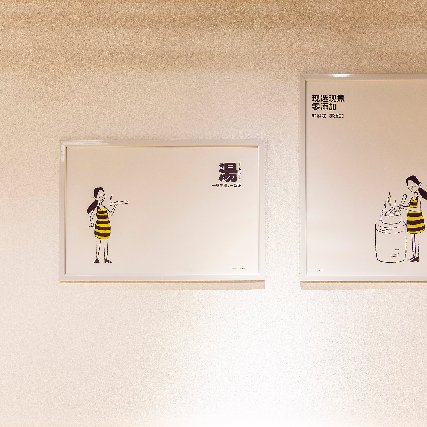
We designed a gentle and lively bright brand identity for Mrs. Wang Spicy Hot Pot, which echoes our strategy, forming a warm and impressive brand personality. In our market research, most of Hotpot's brand image design is based on mainstream text design, and there is a lack of recognition among brands. When there is no obvious difference in consumer experience, it becomes difficult for brands to move to the high end. Based on this, we started from the upgrade of the brand image and pushed the brand to a whole new level.
辉盛重新审视了王姐麻辣烫品牌现有资产,决定以创始人王姐的人物形象为切入点,以勾勒人物形象而成的画面为视觉核心标识。我们创造了栩栩如生的王姐的商业形象。画面中,她眼眸微合,若有所思,似在感受食材的原香,又如构思烹饪新法的创想……我们将「快乐」带入王姐麻辣烫的品牌策略,以大众更易于接受的「治愈系」设计来代替主流麻辣烫「快时尚的冰冷」体验,辅以极具品牌个性的品牌色与和谐的空间设计。我们选取温和活泼的明黄色作为王姐麻辣烫的品牌色,与「现熬牛骨,只为一碗好汤」的策略点相呼应,形成了温暖人心、令人印象深刻的品牌个性。
- Brand Identity
- Space Design
- Communication Design
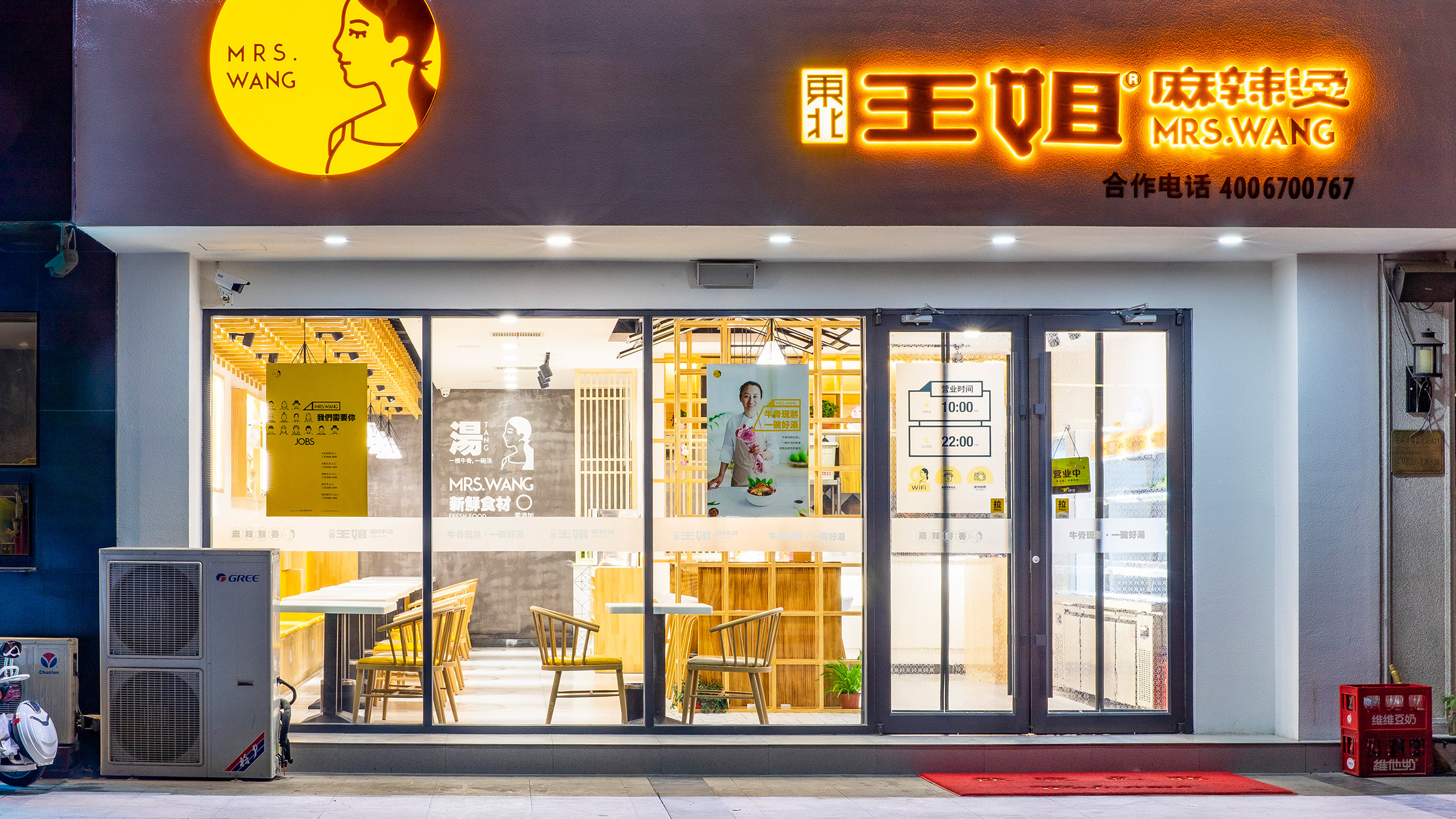


In our market research, most of Hotpot's brand image design is based on mainstream text design, and there is a lack of recognition among brands.

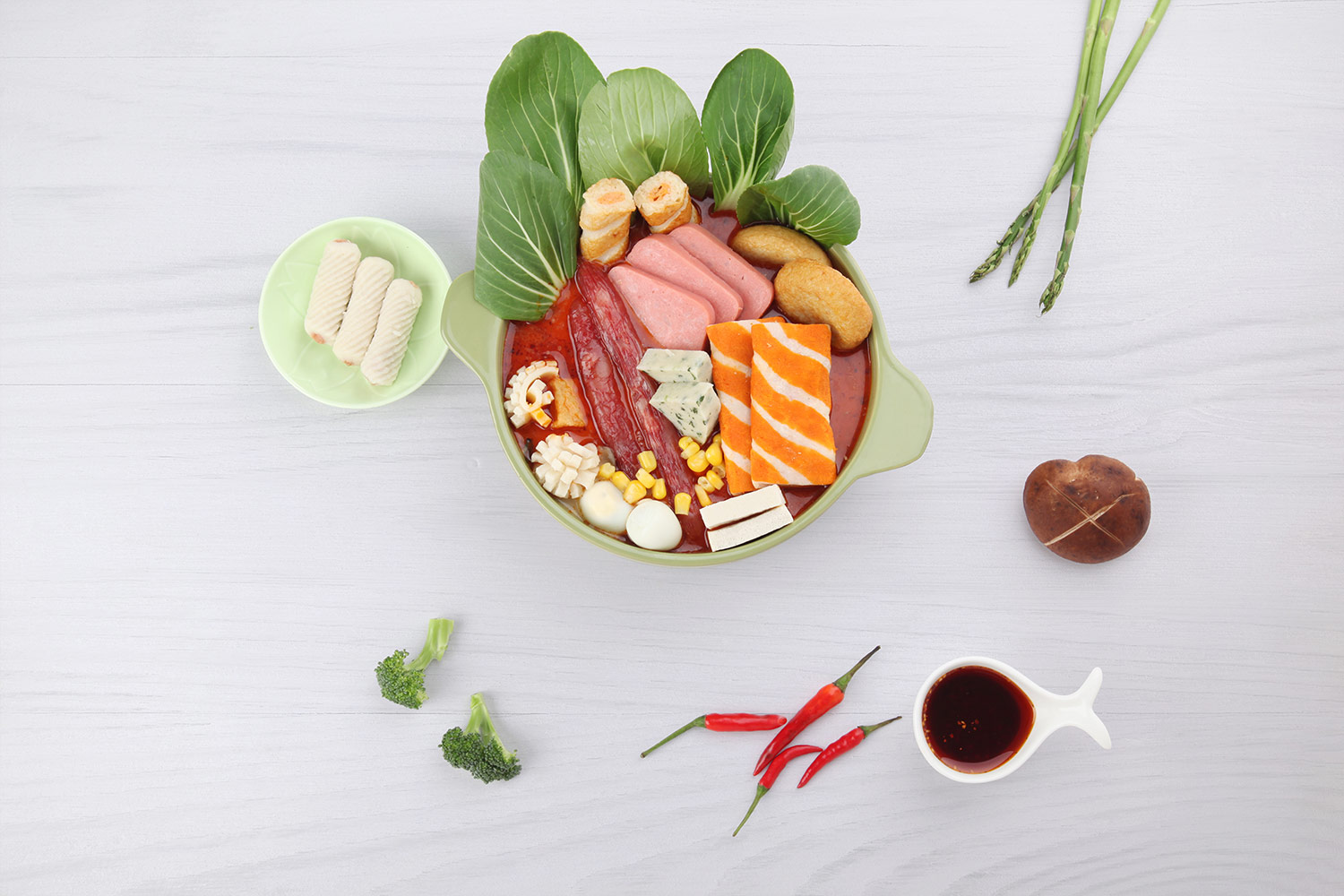
There is no obvious difference in consumer experience, it becomes difficult for brands to move to the high end. Based on this, we started from the upgrade of the brand image and pushed the brand to a whole new level.
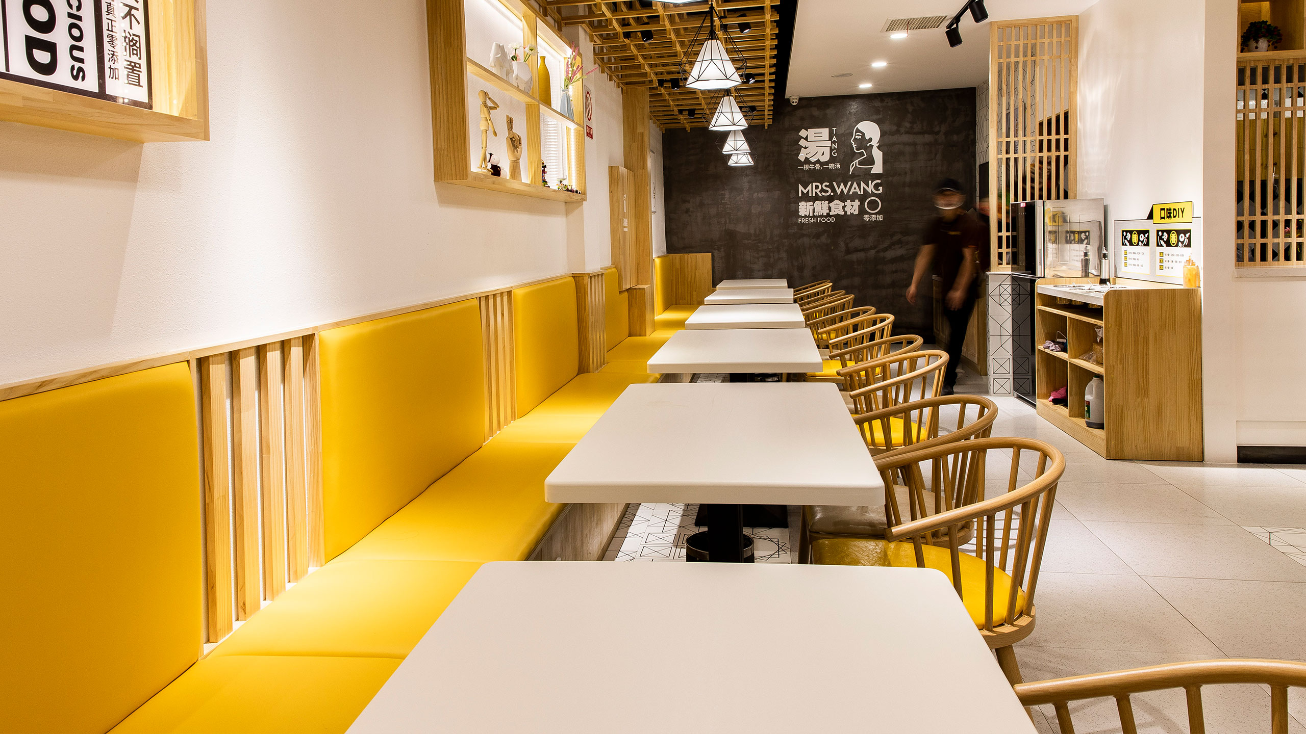


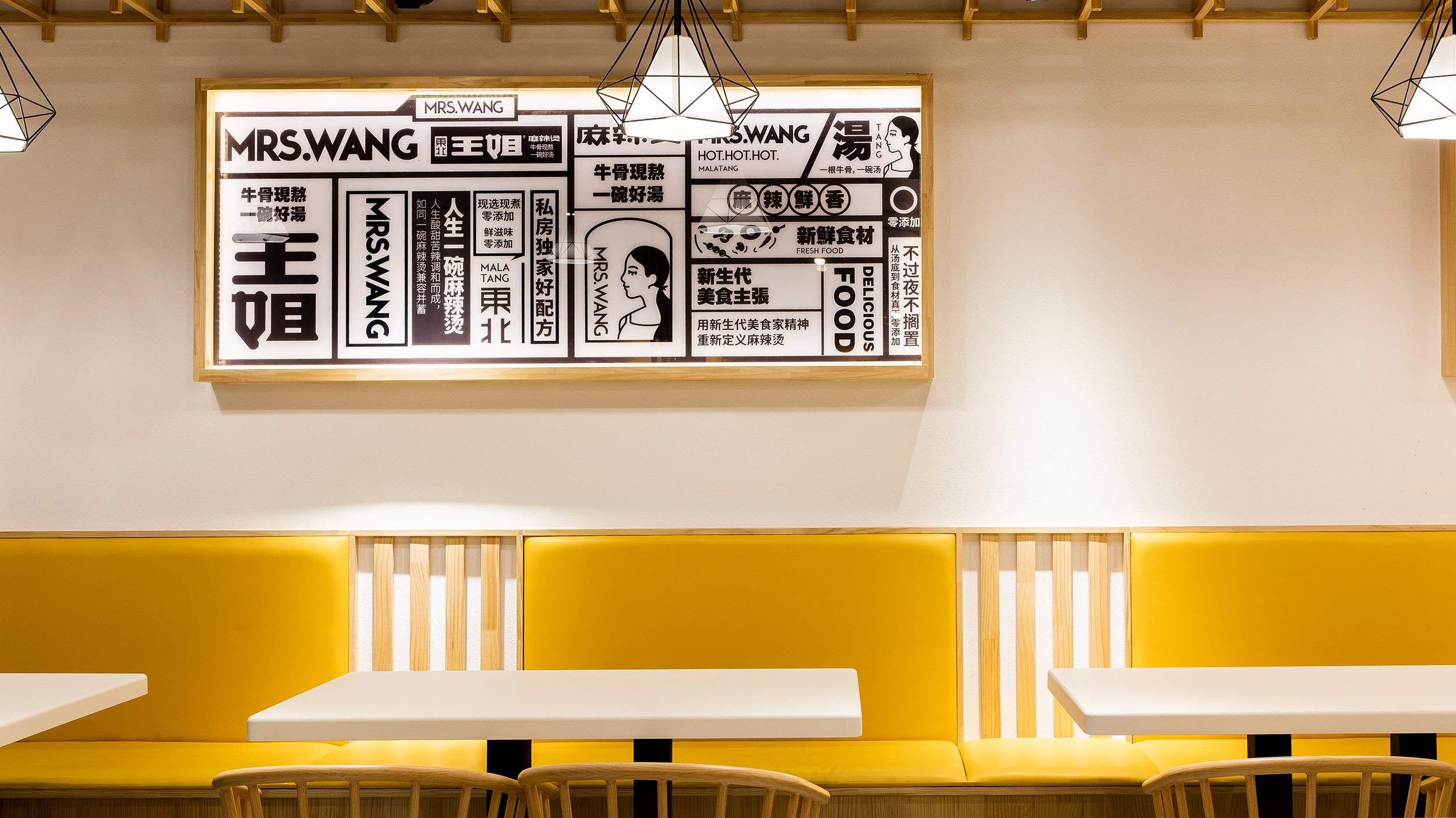

We designed a gentle and lively bright brand identity for Mrs. Wang Spicy Hot Pot, which echoes our strategy, forming a warm and impressive brand personality.
We designed a gentle and lively bright brand identity for Mrs. Wang Spicy Hot Pot, which echoes our strategy, forming a warm and impressive brand personality.


