A Decade of Enlightening Lives with the Spark of Art
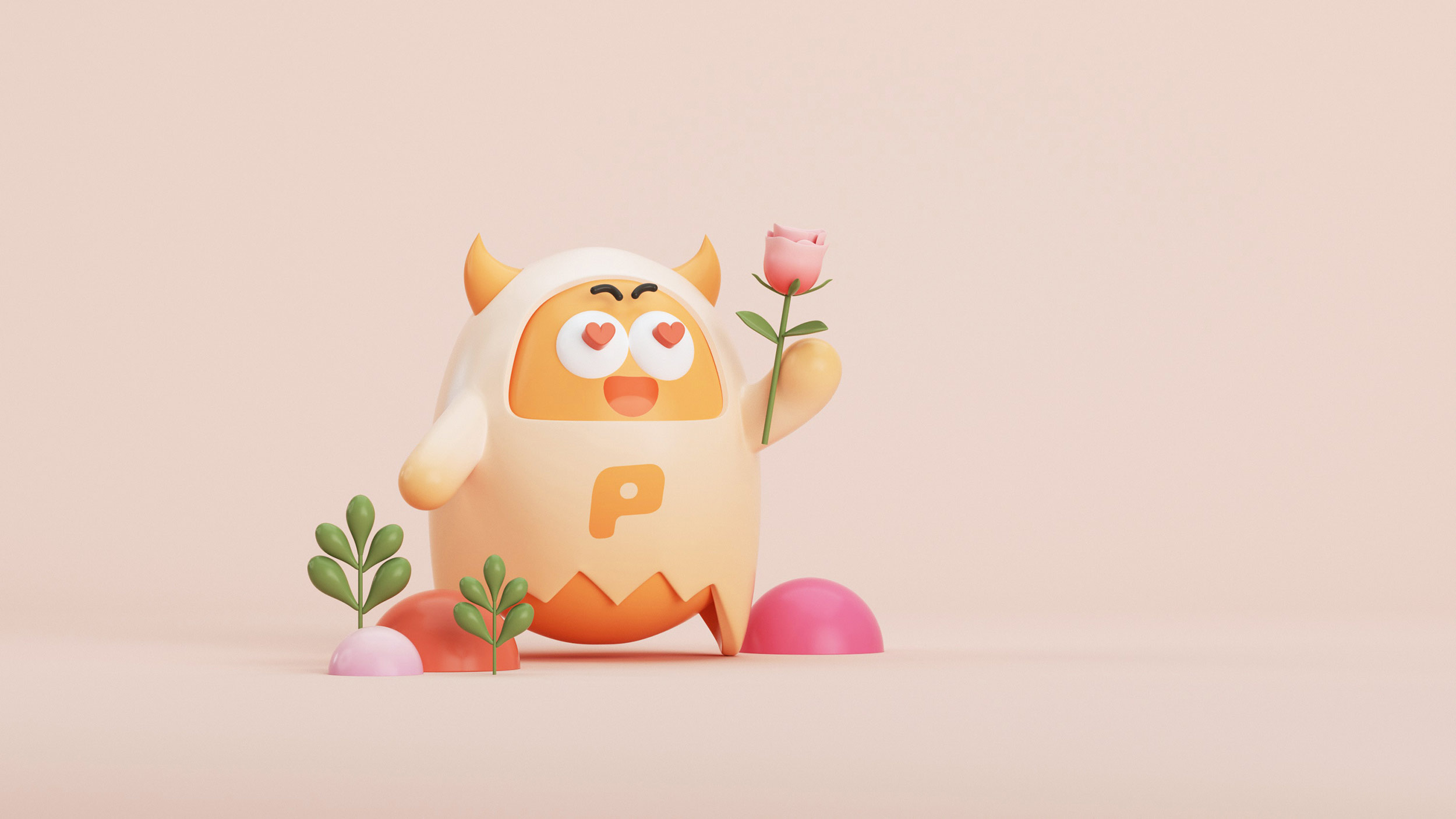
WOA (World Of Art) has been devoted to igniting artistic passion for every individual through their holistic art programs for a decade now. With the compelling slogan "Enlightening Your Artistic Life", they offer comprehensive courses for all ages and inspiring art exhibitions. Celebrating their tenth anniversary, they decided to renew their brand, starting with an innovative take on the 'egg', seen as a symbol of creativity and art's true nature. This principle is strongly embedded in their brand as they strive to continue enlightening people with the magic of art even after their brand upgrade.
WOA绘世界以「启蒙你的艺术人生」为口号,通过专业的美术教育、策展服务和艺术商店,致力于用艺术丰富每一个人的生活。WOA提供面向全年龄段的系统美术课程,既有启发孩子们创造力的课程,也有陪伴成人实现艺术梦想的课程。WOA定期举办主题深度的艺术展览,让艺术家的精神世界通过作品展现。迈入第十个年头,WOA绘世界为庆祝这一里程碑,决定找到RDA进行品牌的升级。这次升级,我们从一个看似简单却包含深意的概念开始——蛋。在我们看来,这个概念不仅象征着孕育艺术的智慧,也体现了WOA绘世界一直秉持的原则——不忘初心,回归艺术的本性。我们通过重新设计,将这一象征融入品牌,以此传达WOA绘世界始终保持的艺术热情和教育理想。重塑后的WOA,将继续致力于将艺术带到更多人的生活中。
RDA在与WOA绘世界的合作中,深入理解了他们「启蒙你的艺术人生」的品牌精神。我们认识到,WOA绘世界不仅是一个提供美术教育的平台,更是一个通过艺术丰富人们生活的社区。在这次品牌升级的过程中,RDA专注于挖掘WOA绘世界的核心价值,并以此为基础,重新塑造品牌形象。选择“蛋”作为升级的核心概念,正是因为它不仅象征着生命的起源和创造力的潜能,也恰如其分地代表了WOA绘世界的教育理念——培养和孕育艺术梦想。RDA团队在设计上采取了创新且富有象征意义的方法,将“蛋”的形象和WOA绘世界的品牌元素相结合,创造出一个既新颖又充满深意的视觉识别系统。
在重新设计的过程中,我们注重保留WOA绘世界原有的品牌精神,同时引入新的视觉语言和品牌信息。这不仅使得品牌形象更加鲜明和吸引人,也更好地传达了WOA绘世界关于艺术教育和文化推广的理念。通过这次品牌升级,WOA绘世界的形象将更加突出,其教育和文化推广的使命也将得到更广泛的认可和支持。
- Brand Identity Design
- Communication
- Space Identity Design
- 品牌视觉识别设计
- 品牌传播设计
- 店面空间设计


WOA Art World has been devoted to igniting artistic passion for every individual through their holistic art programs for a decade now. With the compelling slogan "Enlightening Your Artistic Life", they offer comprehensive courses for all ages and inspiring art exhibitions.


Celebrating their tenth anniversary, they decided to renew their brand, starting with an innovative take on the 'egg', seen as a symbol of creativity and art's true nature. This principle is strongly embedded in their brand as they strive to continue enlightening people with the magic of art even after their brand upgrade.


Starting with an innovative take on the 'egg', seen as a symbol of creativity and art's true nature. This principle is strongly embedded in their brand as they strive to continue enlightening people with the magic of art even after their brand upgrade.


