

Minimal Form, Maximum Emotion: How Lansidai Reinvented Its Identity
蓝丝带2026全新品牌视觉形象升级设计
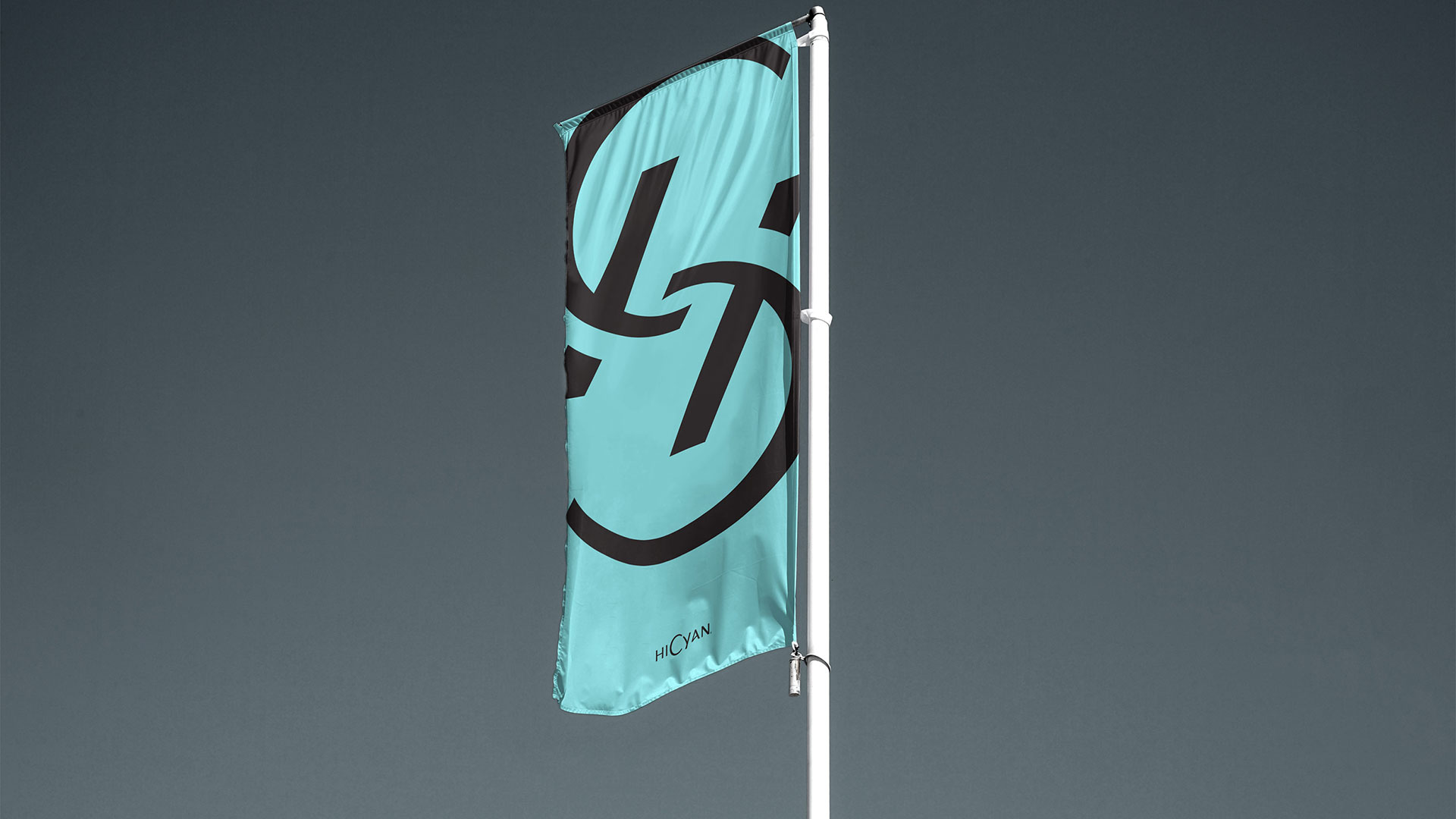
Lansidai's rebranding reimagines a traditional care symbol into a modern, strategic brand language. With simplified geometry and symmetrical, rounded structures, the new logo transforms the emotional concept of “care and protection” into a powerful, minimal visual symbol. The updated pale cyan-blue, inspired by the Chinese philosophy of “Qing out of Lan,” reflects a generational shift—projecting warmth, openness, and forward-looking vitality. This core color enhances digital presence and user affinity across platforms. Typeface redesign further strengthens visual clarity and coherence through a sans-serif, grid-based aesthetic aligned with digital-era communication. Rather than decoration, the new visual identity becomes a functional system: scalable, emotionally resonant, and future-proofed for service extension and sub-brand expansion. Lansidai is no longer just a logo—it becomes an ambient symbol of empathy, professionalism, and trust.
在2019年,RDA曾为蓝丝带建立上一代品牌视觉形象系统,而如今,我们面临一个命题:如何让一个传统关爱符号焕发出属于当下时代的更年轻的力量。蓝丝带,作为关怀与守护的象征,其情感温度早已深入人心,RDA认为,品牌的视觉语言应当更有效回应当下的传播环境和媒介需求。我们从品牌精神出发,以极简几何重构蓝丝带形象,弱化具象,强化感知,打造一个具有高识别力与传播力的超级符号。圆润的等线结构传递稳定与温柔,浅青蓝的主色不仅强化品牌年轻化视觉,也唤起东方哲学“青出于蓝”的意象。字体与色彩的更新同步完成,从视觉美学、信息清晰度到媒介适配性全面提升,使蓝丝带从一个图形标识,进化为可感知、可延展的视觉语言系统,实现品牌在数字时代的战略性转型。
- 品牌策略识别
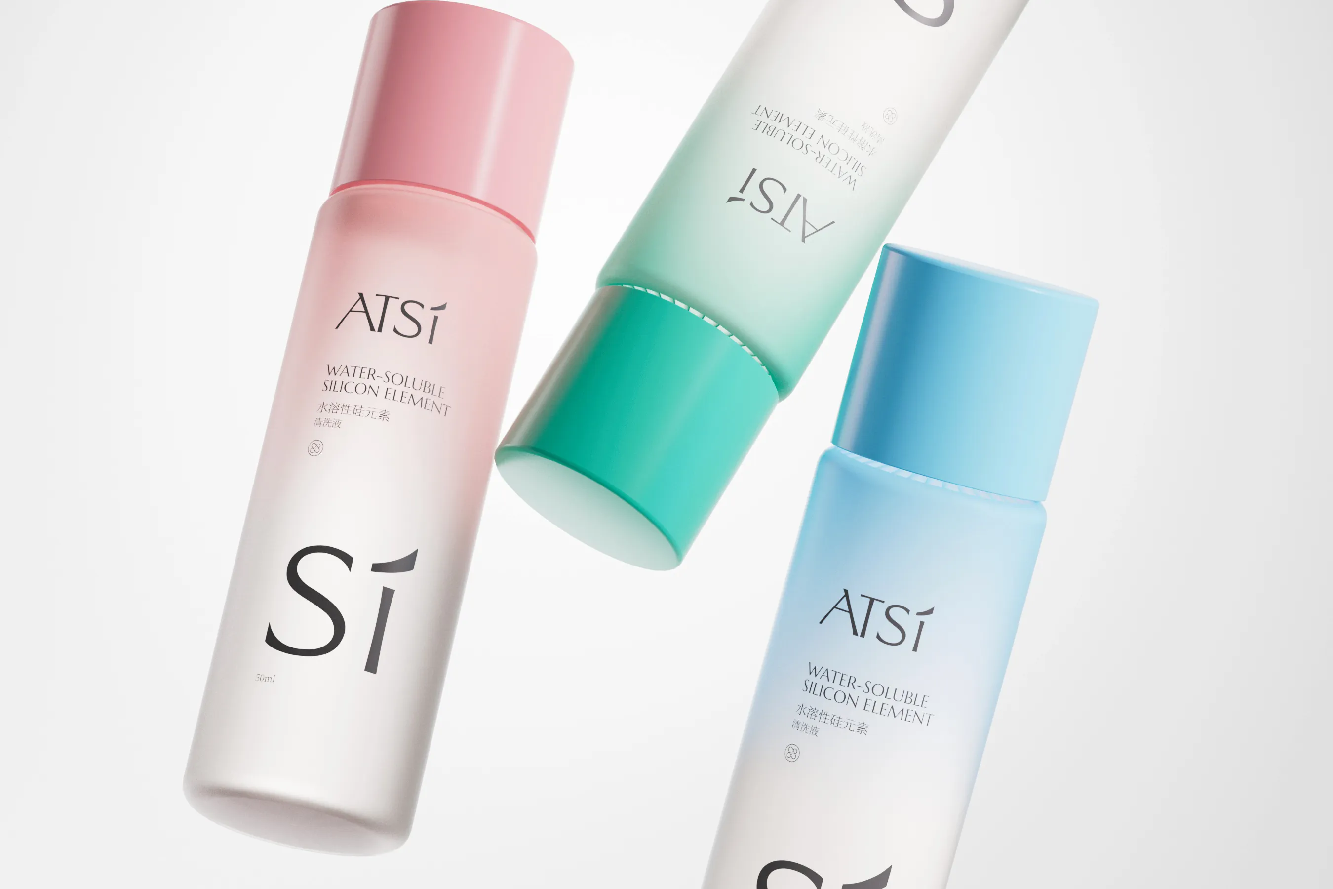
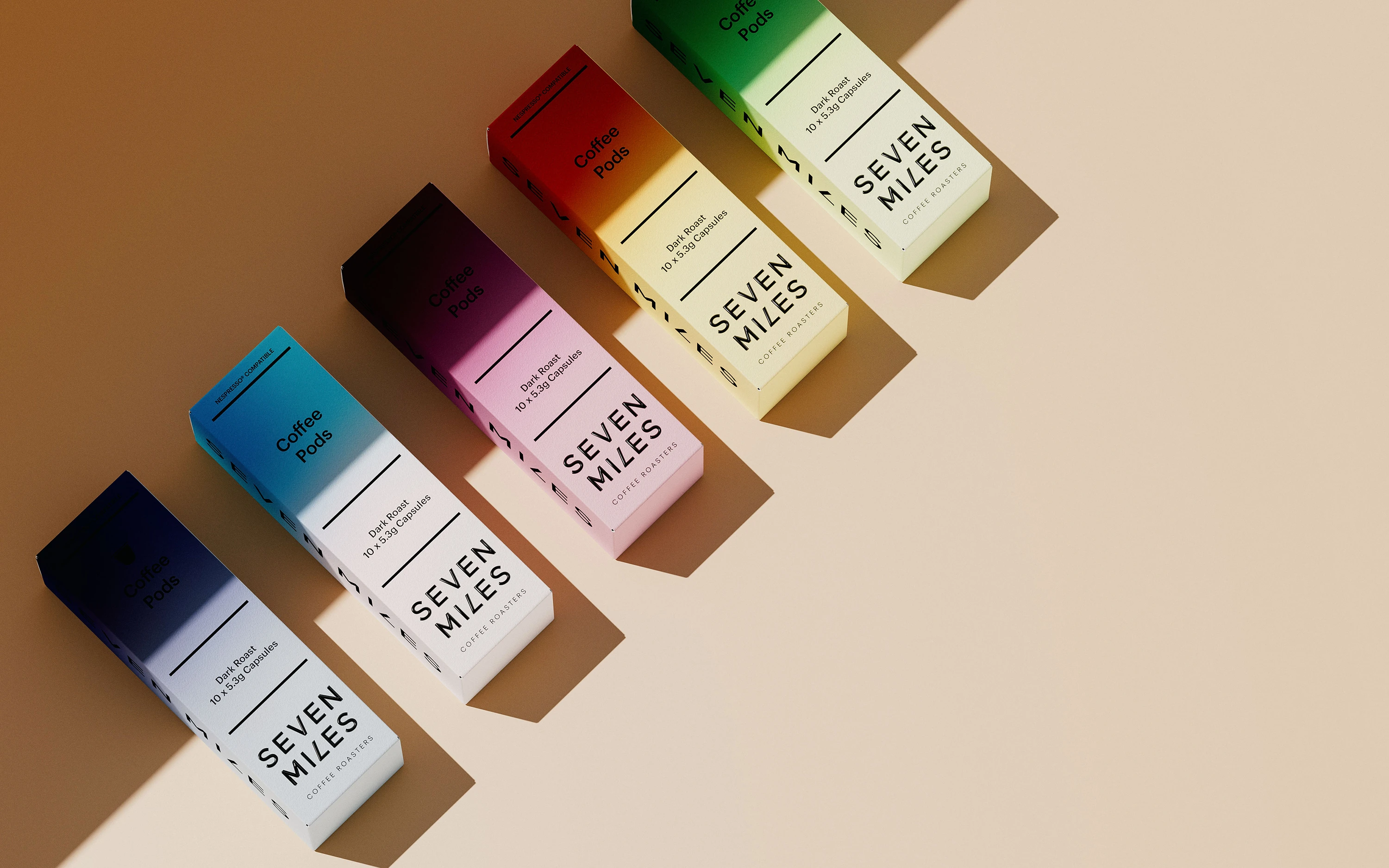
- 产品包装设计
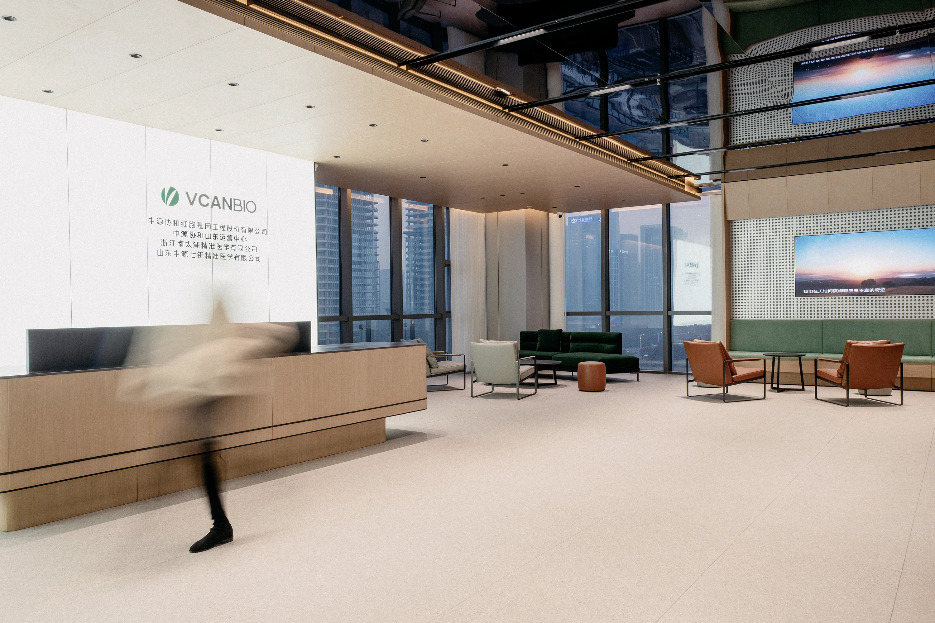
- 连锁店空间设计


Background
As a long-standing symbol of care and protection, Lansidai carries deep emotional resonance. However, its previous identity lagged behind modern visual and digital expectations. The brand sought a comprehensive upgrade to enhance recognizability, adapt to digital contexts, and build a forward-looking visual strategy.
蓝丝带作为“关爱”与“守护”的代名词,承载着公众深厚的情感认知。然而,其原有的视觉系统在面对数字媒介与年轻群体时,显得滞后与笨重。品牌方希望通过一次全面升级,不仅强化品牌识别力,也实现跨媒介传播的适配性,构建面向未来的视觉战略基础。


Challenge
The challenge was to go beyond surface-level redesign. The goal was to create a universally adaptable and emotionally intelligent symbol, while preserving the brand’s original spirit. The previous identity was too figurative and structurally complex, limiting its clarity and digital adaptability.
我们需解决的,不只是设计焕新,更是如何在尊重原有情感价值的基础上构建一个可传播、可延展的超级符号。旧标识的具象化与繁复结构限制了在数字时代的传播效率;同时,品牌色彩与字体系统也亟需更新,以符合年轻人群的审美趋势与使用场景。


Solution
RDA reimagined Lansidai brand using minimal geometry, creating a soft, balanced, and emotionally charged visual language. The new pale cyan-blue embodies warmth and openness, while echoing the Eastern philosophy of evolving from tradition. A sans-serif typeface enhances clarity and adaptability. This systemized visual identity ensures coherence across services, products, and future sub-brands.
我们以极简几何重构蓝丝带图形,打造圆润、稳定、具有温度的视觉语言。主色调更新为偏青浅蓝,传达温柔且开放的关怀感,同时融入东方哲学“青出于蓝”的意象。字体采用等线体风格,提升信息清晰度与媒介适配性。全新视觉系统不仅强化品牌印象,也为其未来在产品延展、服务系统与子品牌构建中提供统一语言支持。


Empower Your Brand
Starting Now.
RDA specializes in brand identity, commercial space design, and digital marketing with a focus on essentialism and international design aesthetics. We create emotionally resonant brands that drive business success. Beyond design solutions, we uncover brand potential through strategic positioning and innovation, delivering lasting value in competitive markets. Whether domestic or global, RDA offers expertise to shape a promising future for your brand. Contact us to start your branding journey.
塑造品牌,定义领先。RDA以极致和国际主义的设计风格为企业提供品牌形象识别设计VI系统,商业空间设计和数字营销设计服务。塑造感动人心的品牌和体验,让品牌成为驱动商业向前的力量。辉盛不仅是设计解决方案的提供者,更是品牌潜力的开掘者。我们通过深度的策略定位和创新设计,致力于在竞争激烈的市场中为品牌塑造独特而持久的价值。无论是在国内还是国际舞台,辉盛都以其独特的视角和专业能力,为品牌的未来指引方向。 联系我们开启品牌之路:


