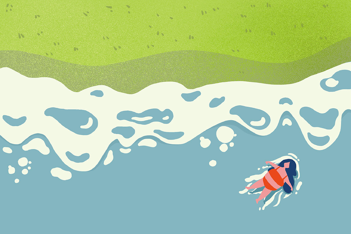
A rebranding back to nature
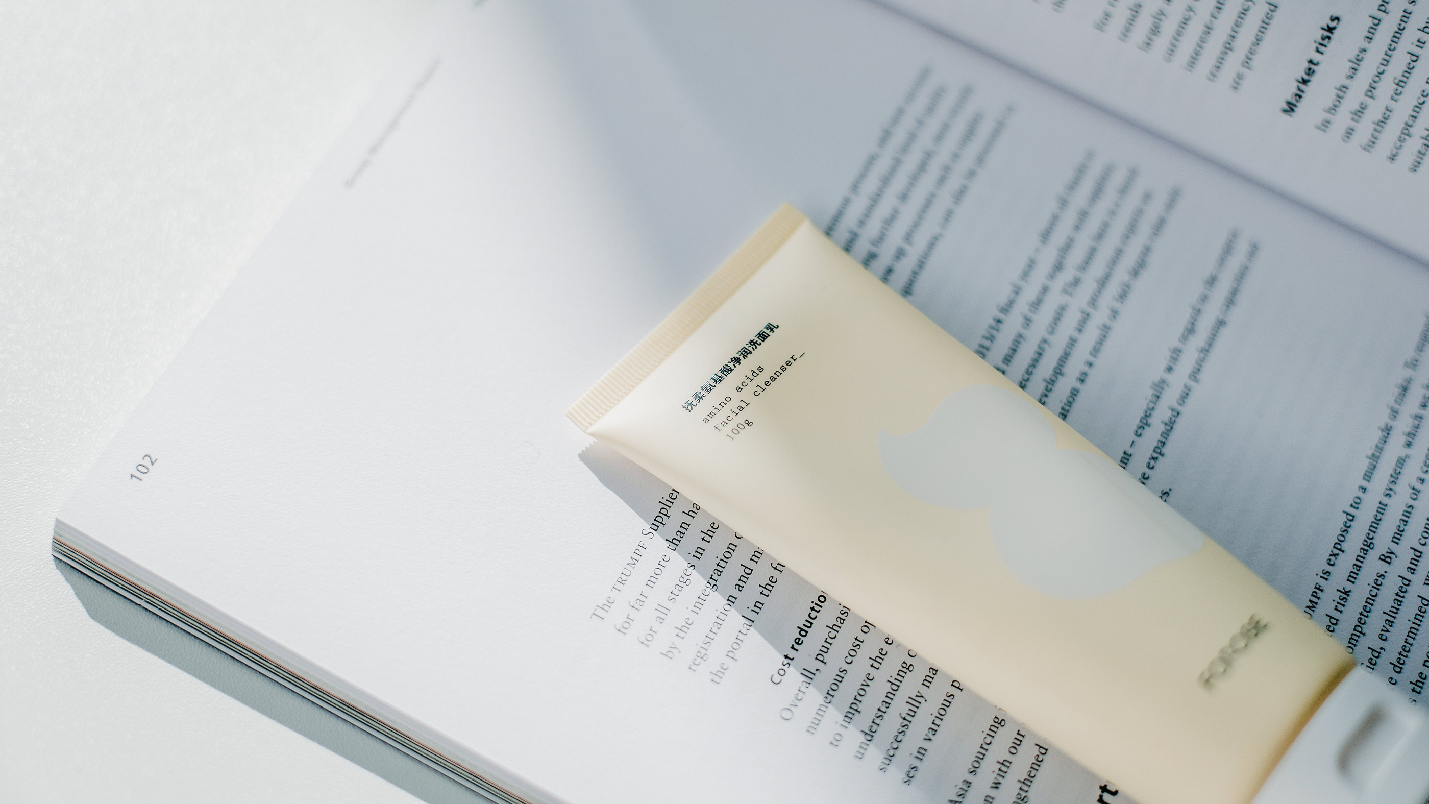
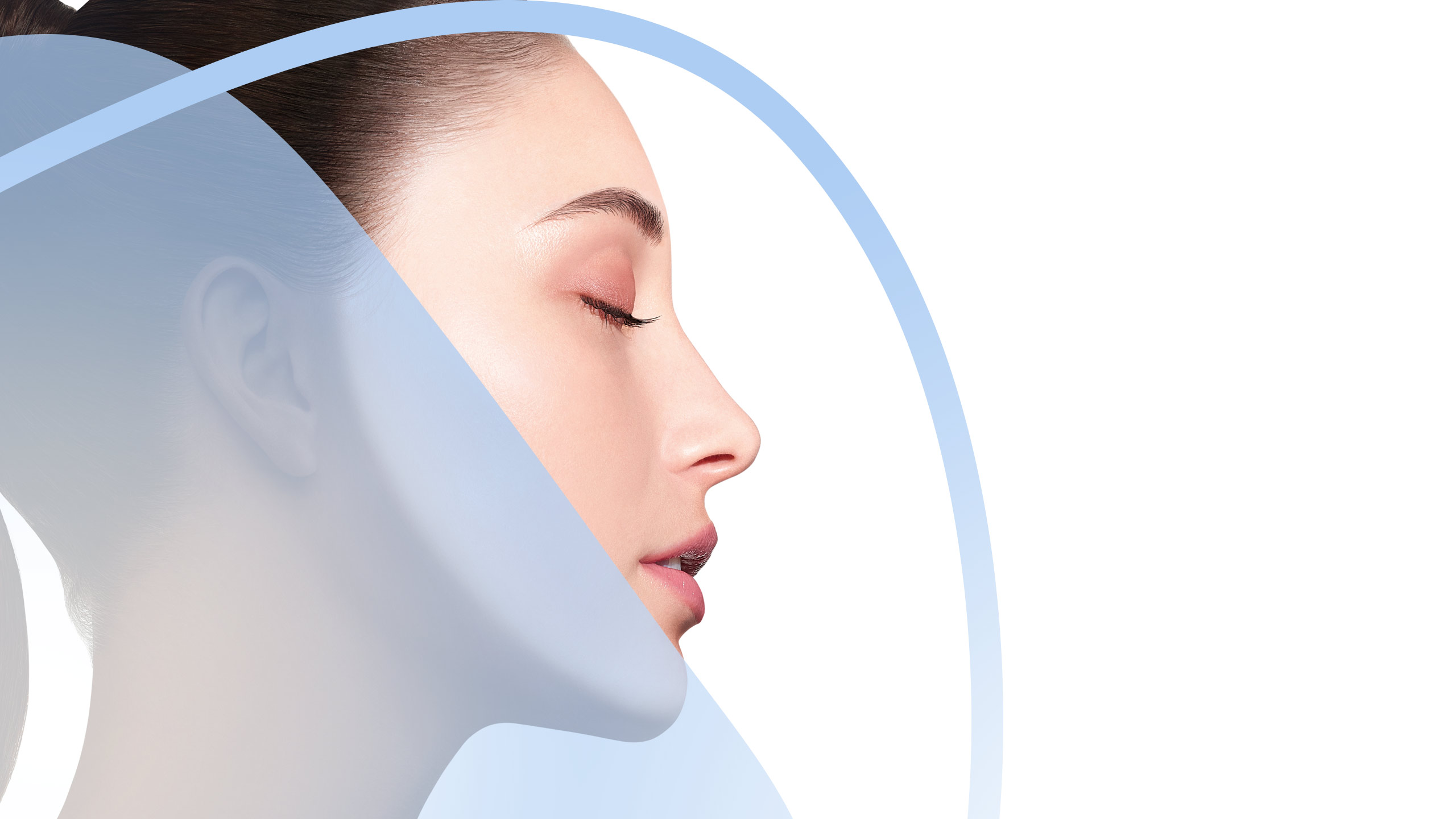
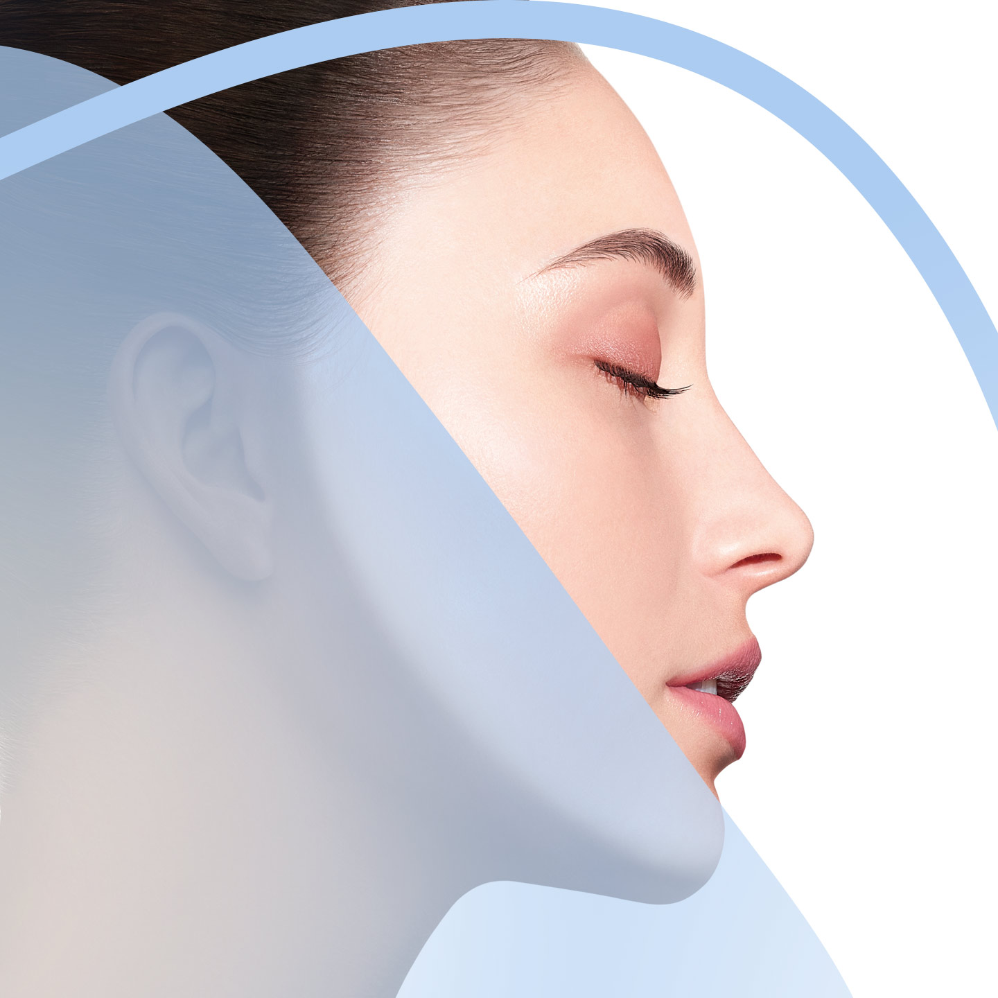
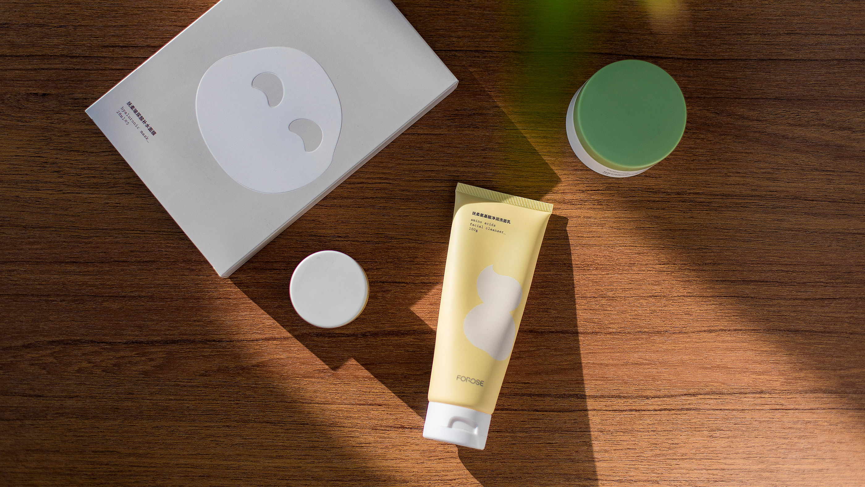
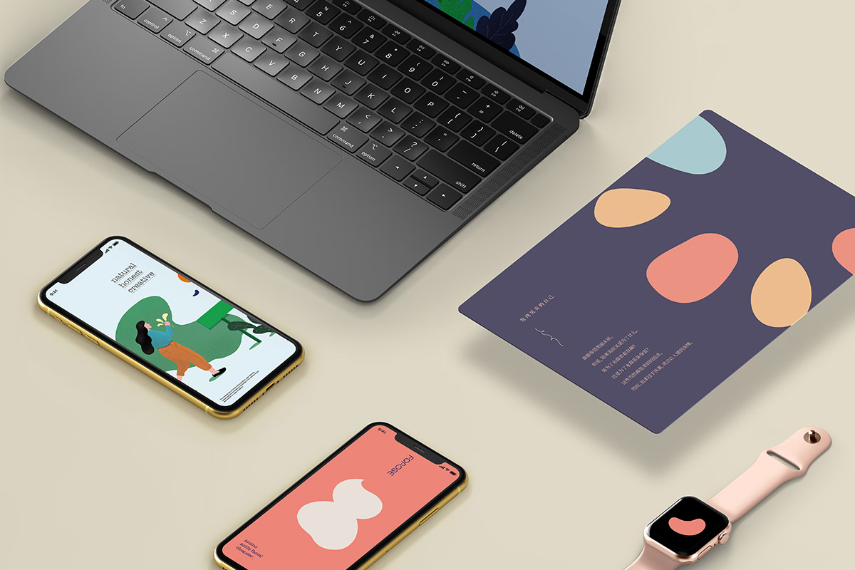
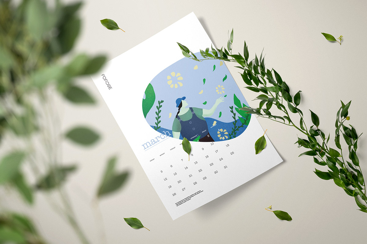
The new Forose series product design concept takes nature and freedom as the design theme, highlighting the brand's focus on using natural raw materials, and hopes that our consumers can face life with a more comfortable attitude. The new packaging design uses interlocking patterns and colors to refer to the characteristics and advantages of the product. The feeling brought by the use of Forose is compared with a variety of rounded graphics, and it is displayed in the packaging in a series. Through the natural and transparent simple graphics and colors, it shows the healthy and moist and gentle use experience brought by natural raw materials.
全新Forose系列产品设计理念以自然和自由做为设计主题,凸显品牌专注于使用自然原材料的概念,并希望让我们的消费者能以更为自在的心态面对生活。新的包装设计以连动的图案和色彩指代产品的特性和优势,将使用Forose带来的感觉用各式各样的圆润图形来比喻,并系列化的展现于包装。通过极具自然透明感的简洁图形和色彩,表现出自然原材料带来的健康湿润以及温和的使用体验。为了配合新品的推出,设计团队特别重新设计了Forose字型,在让品牌形象年轻化的同时,也令Forose品牌更为适合整体包装风格,这一去除繁杂,回归简朴的设计贯穿始终,令Forose更具年轻和时代的活力。
- Brand Identity
- Space Design
- Communication Design

We highlighting the brand's focus on using natural raw materials, and hopes that our consumers can face life with a more comfortable attitude.
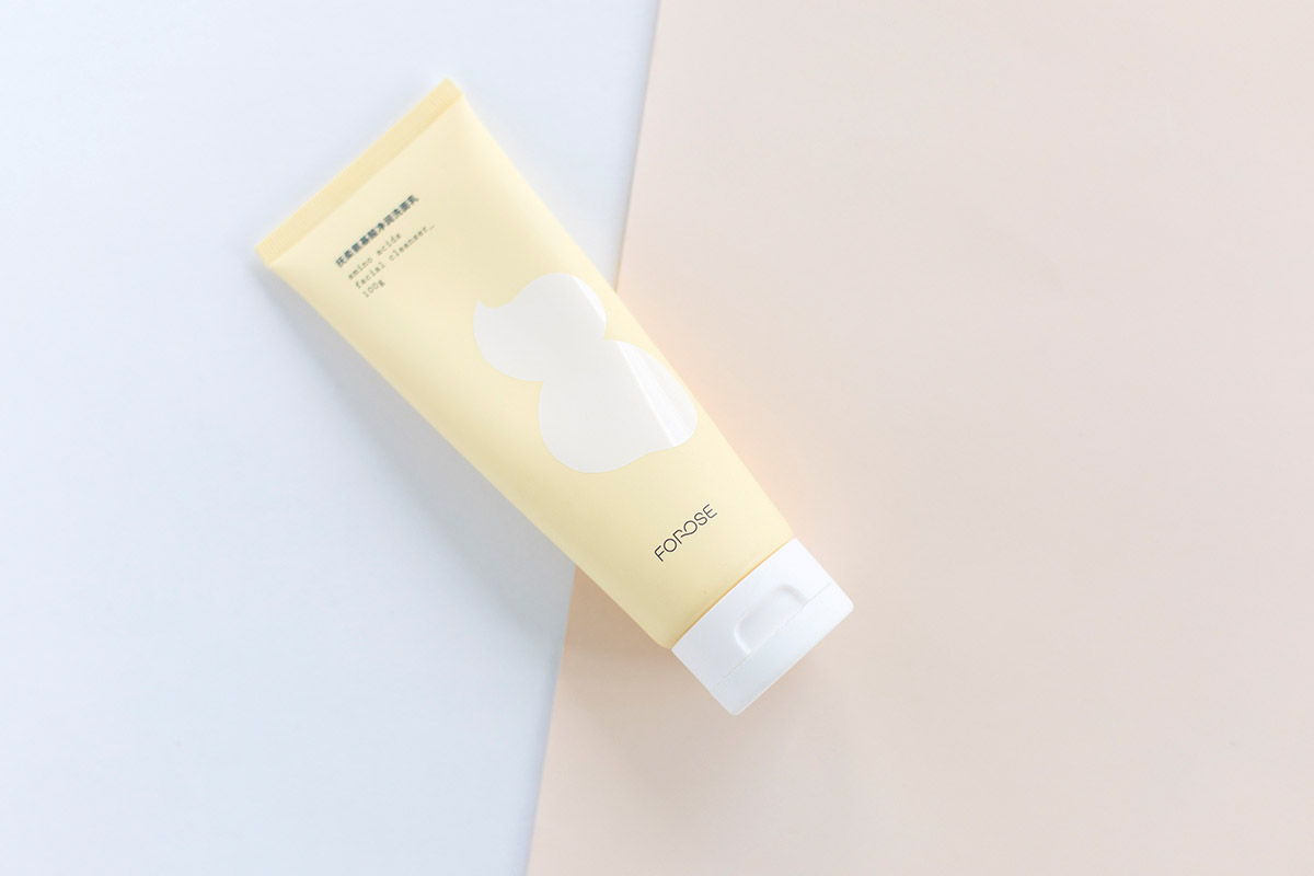
The new packaging design uses interlocking patterns and colors to refer to the characteristics and advantages of the product.
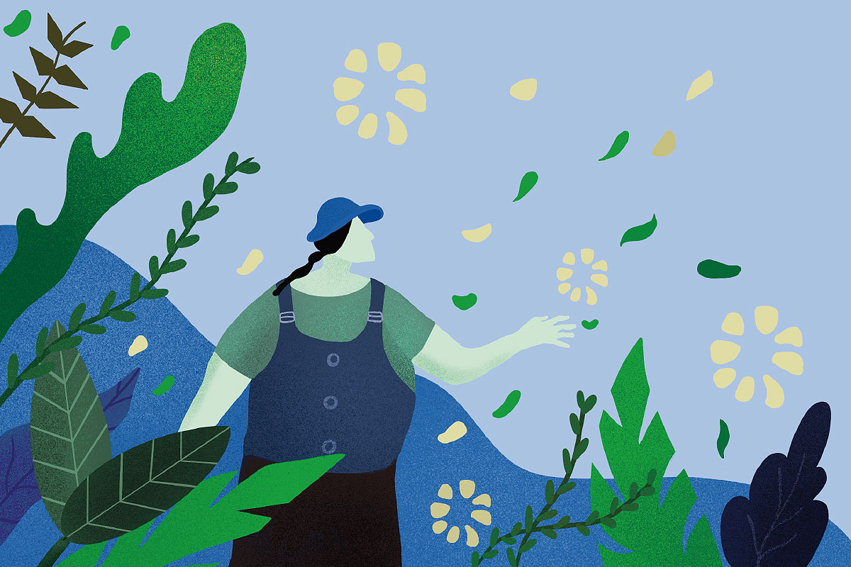
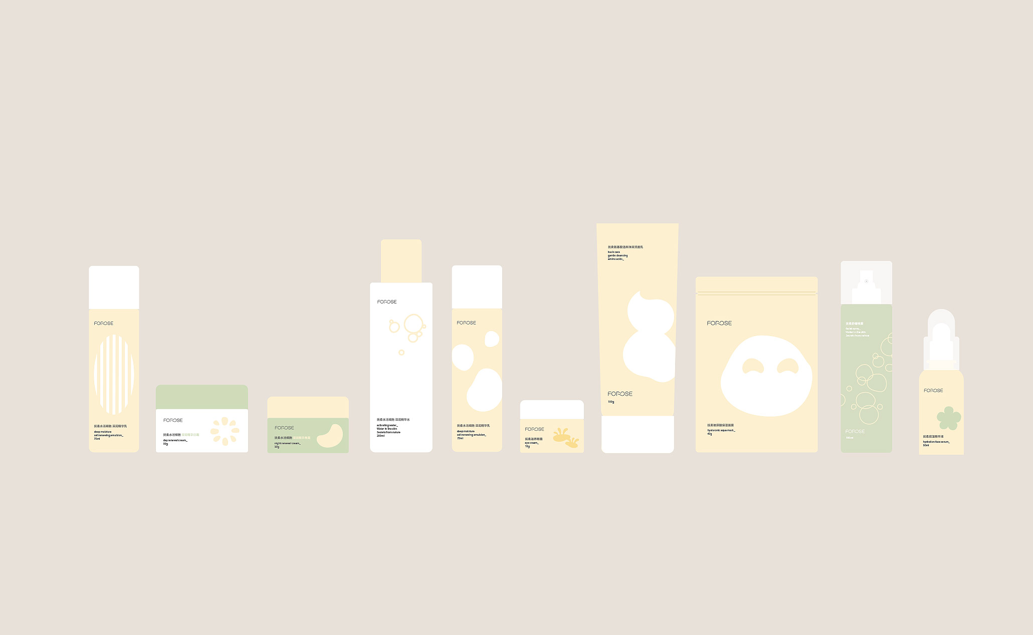
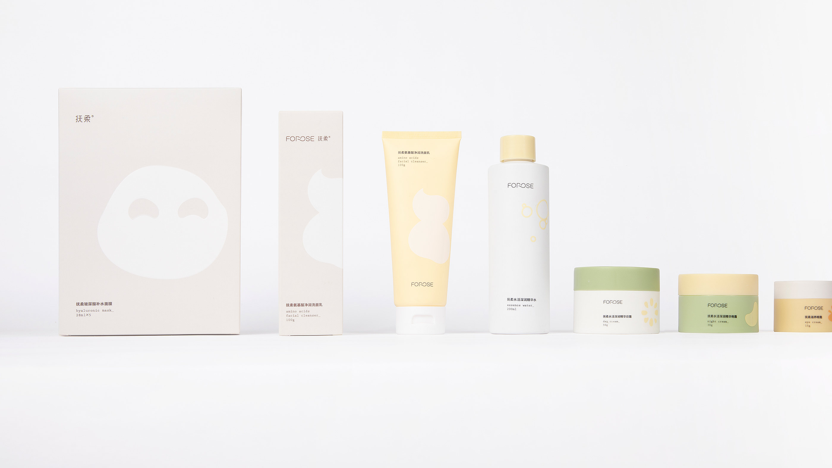

The feeling brought by the use of Forose is compared with a variety of rounded graphics, and it is displayed in the packaging in a series.
Through the natural and transparent simple graphics and colors, it shows the healthy and moist and gentle use experience brought by natural raw materials.