The symbol that drives an enterprise forward.
山东万事达集团企业形象整体设计/传播设计
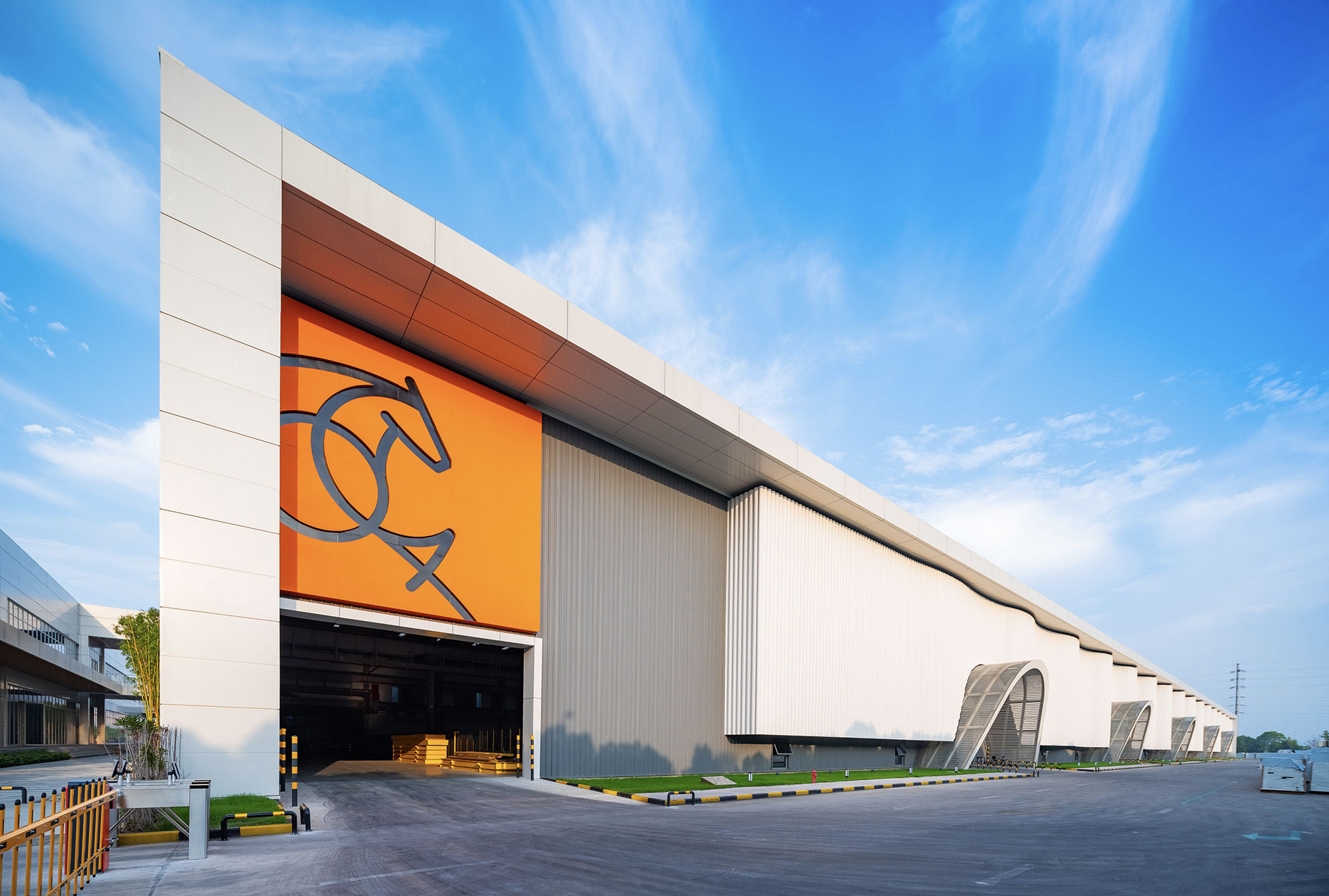
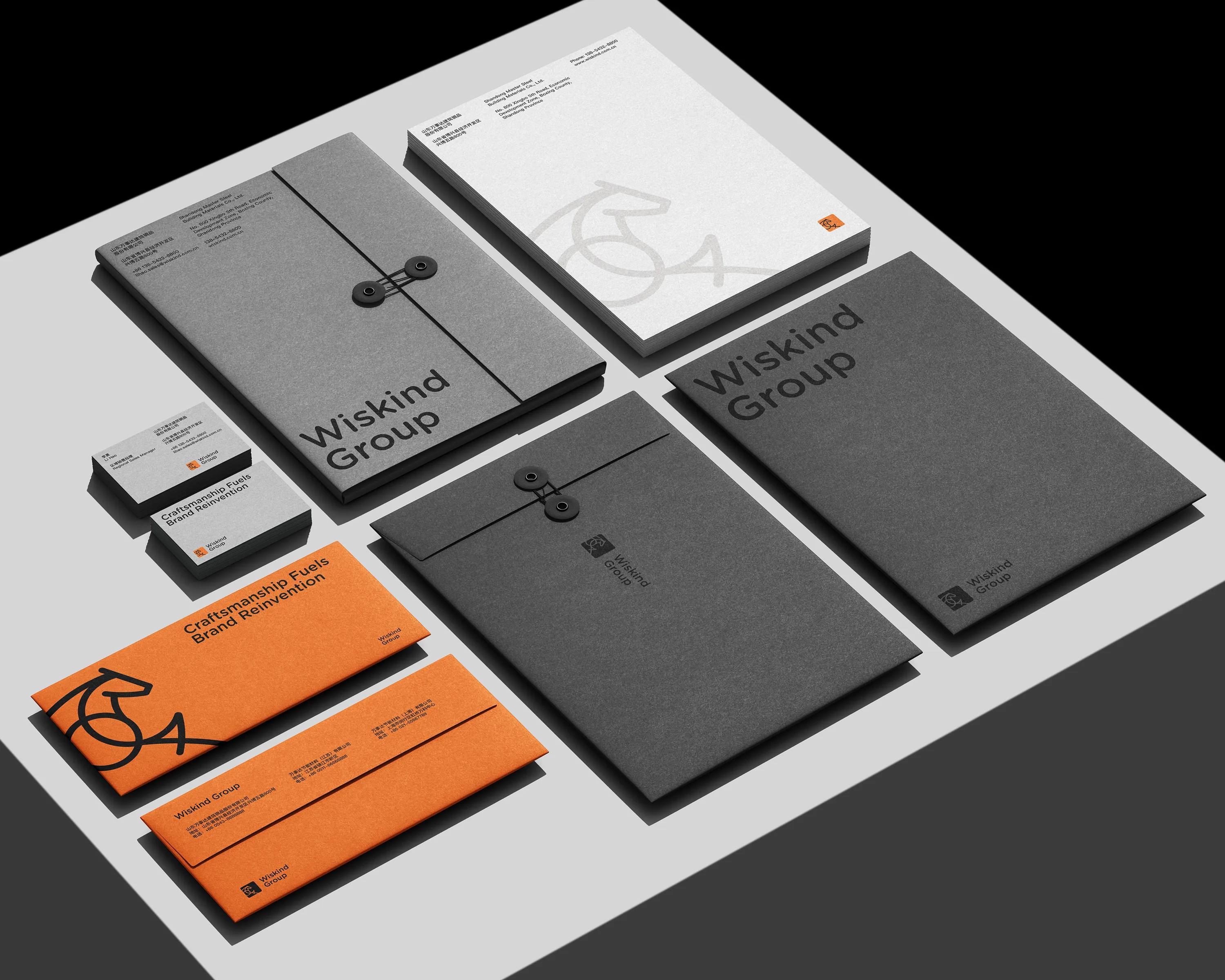
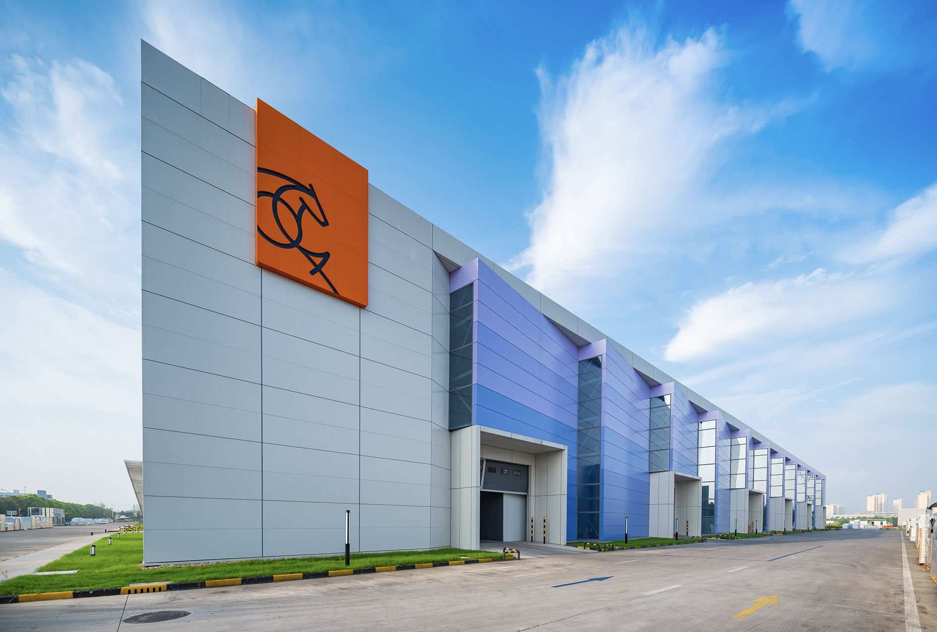
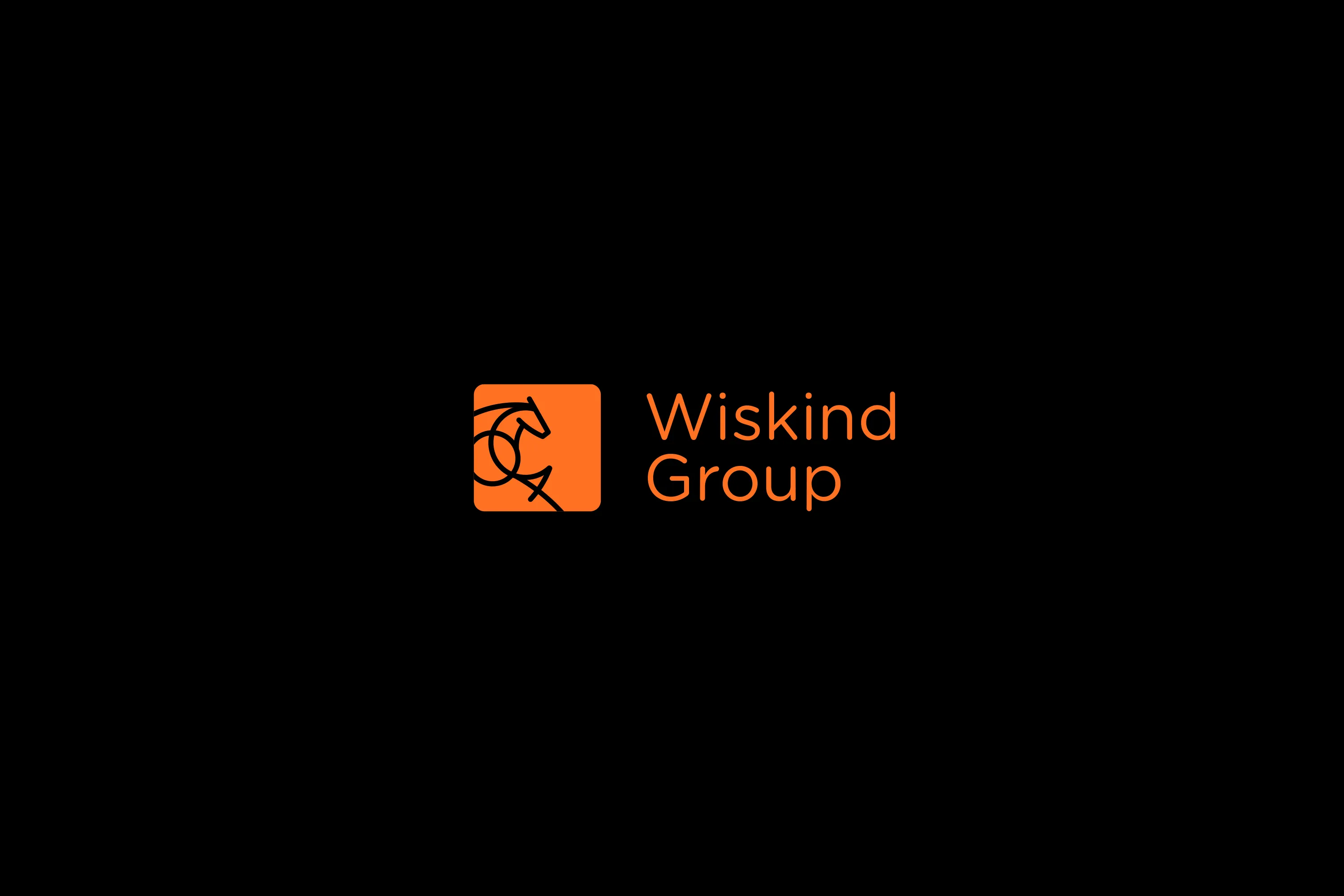
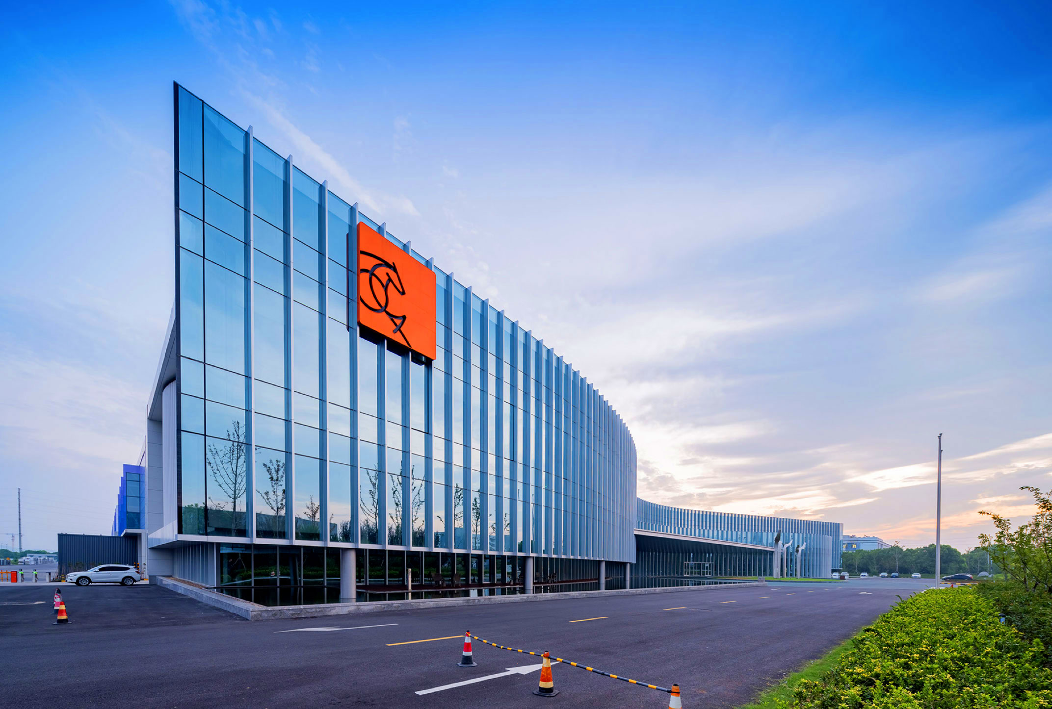
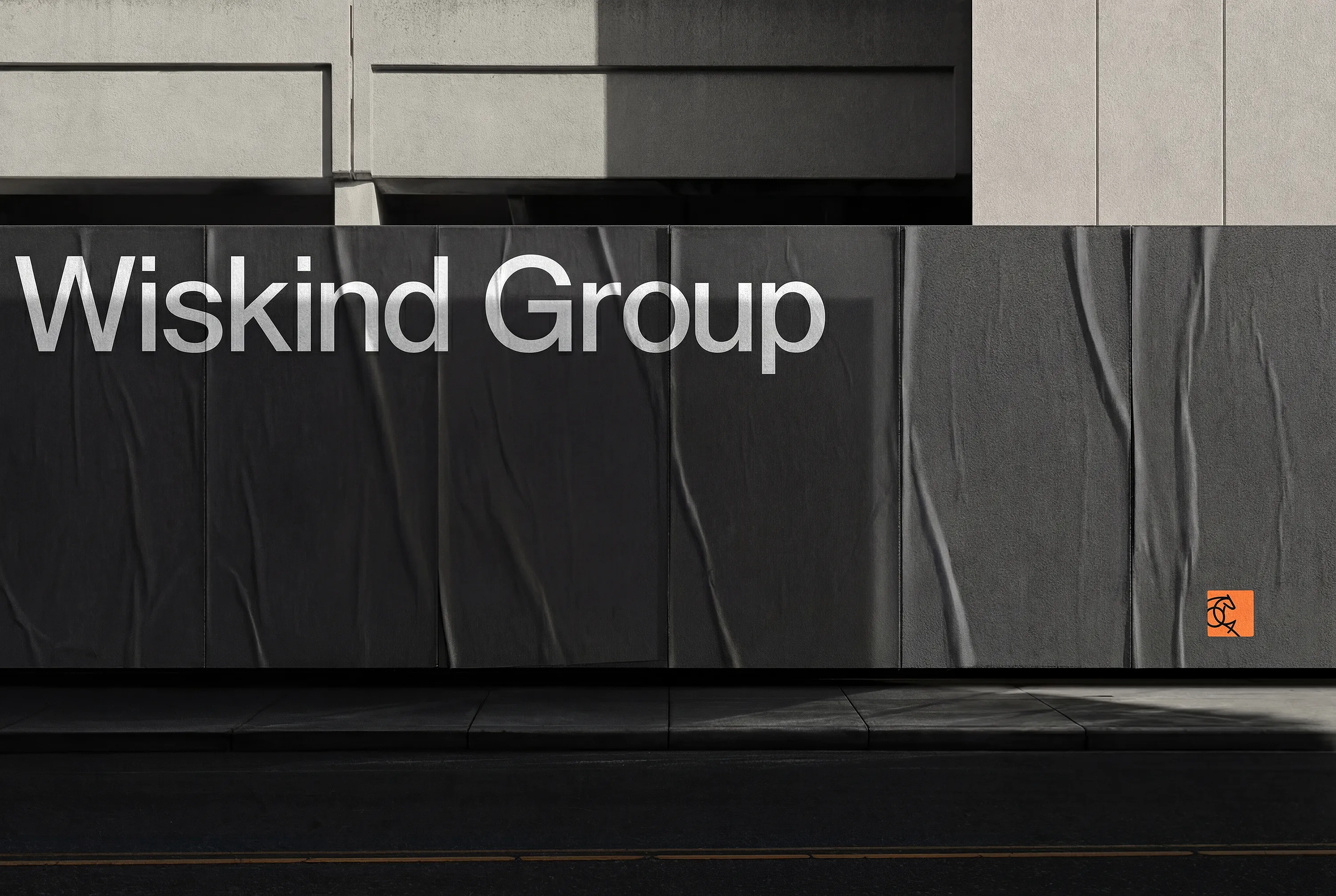
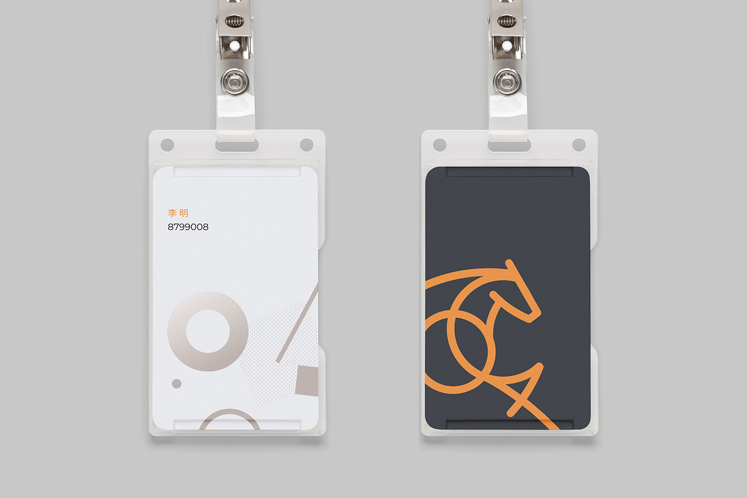
Forty years ago, Master Group began its journey with a single pony powering a machine—an image that sparked a legacy of innovation. Staying true to its spirit of craftsmanship, Master has consistently advanced its manufacturing excellence and brand vision. Inspired by the symbol of the pony, we developed a refreshed visual identity system that conveys resilience, determination, and momentum. This renewed identity equips Master to tackle future challenges with renewed confidence and clarity.
四十年前,万事达集团以一匹驱动加工机的小马为起点,开启了以技术革新为核心的发展历程。时至今日,万事达始终坚守工匠精神,持续推动制造能力与品牌文化双重升级。以“小马”为灵感核心,我们为其构建了全新品牌视觉系统与形象识别标准,传达出进取不息、动力永续的品牌精神。此次焕新不仅重塑了品牌表达,也进一步强化了万事达面对新挑战的文化信念。从2008年起,辉盛与万事达展开深度合作,始终陪伴其品牌成长。我们在协助其打造标志性视觉形象的同时,也共同探索企业文化在新时代背景下的传承与演进。未来,辉盛将继续携手万事达,以设计驱动品牌转型,书写更具远见的新篇章。
- Brand Identity
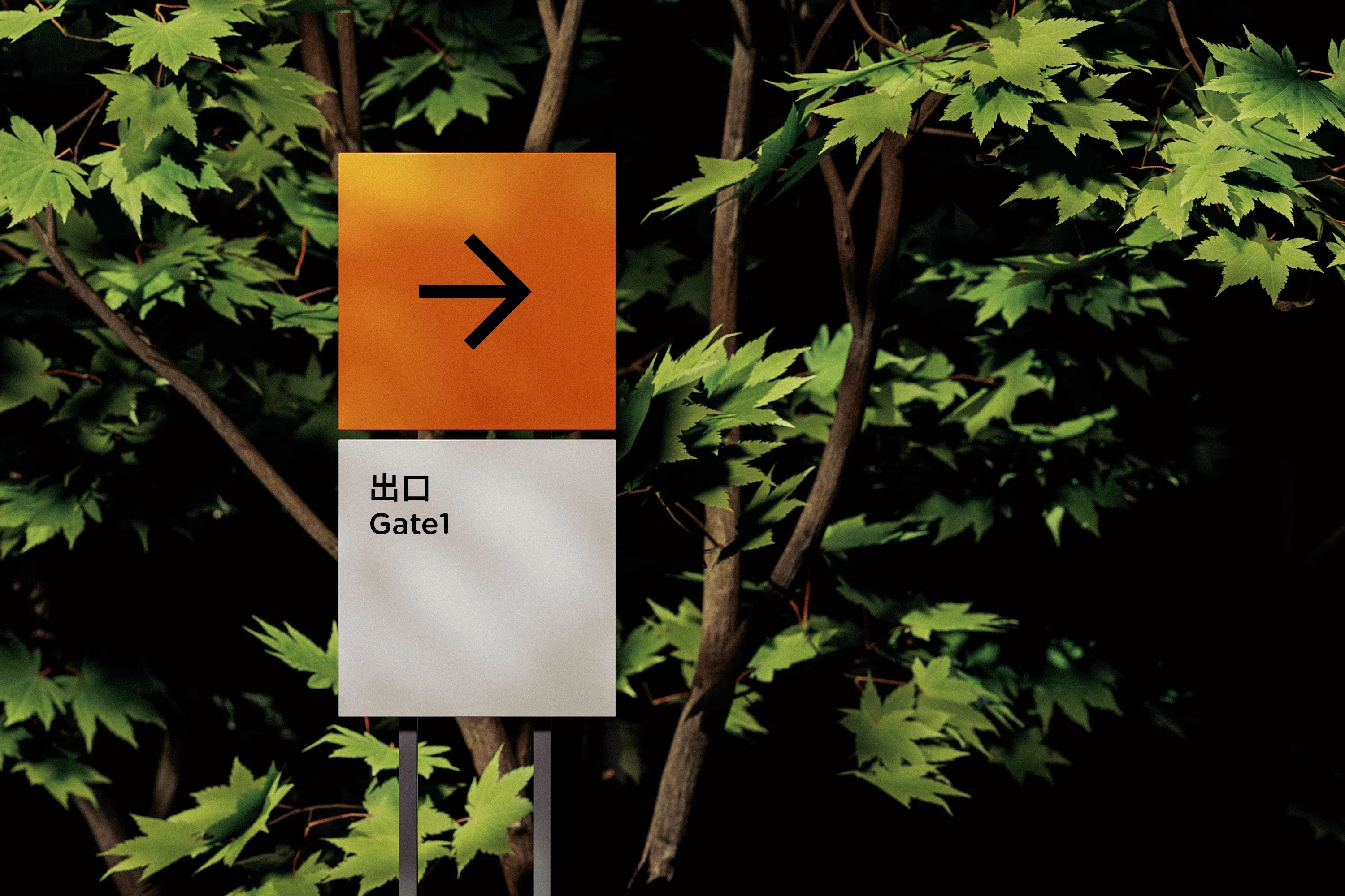
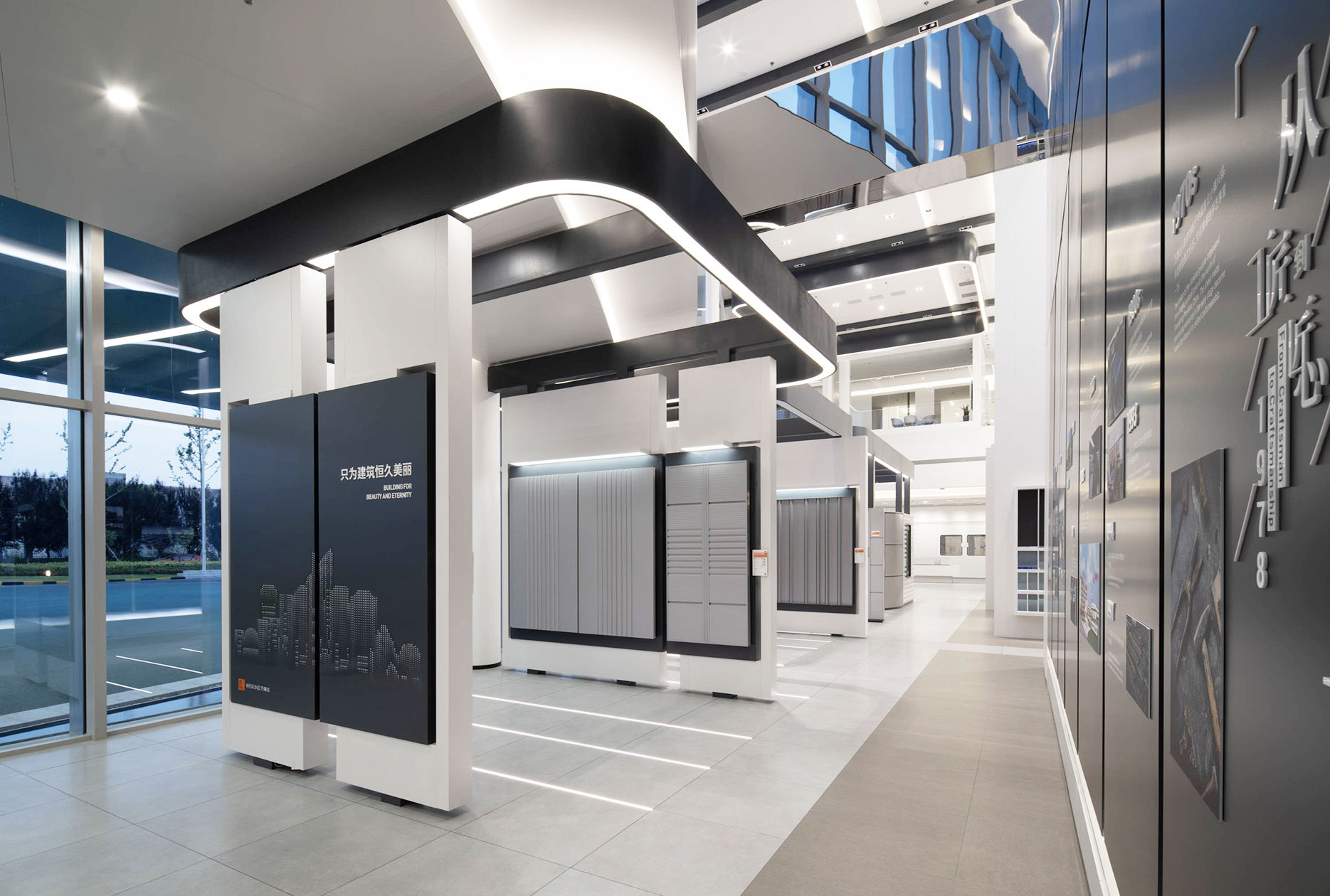
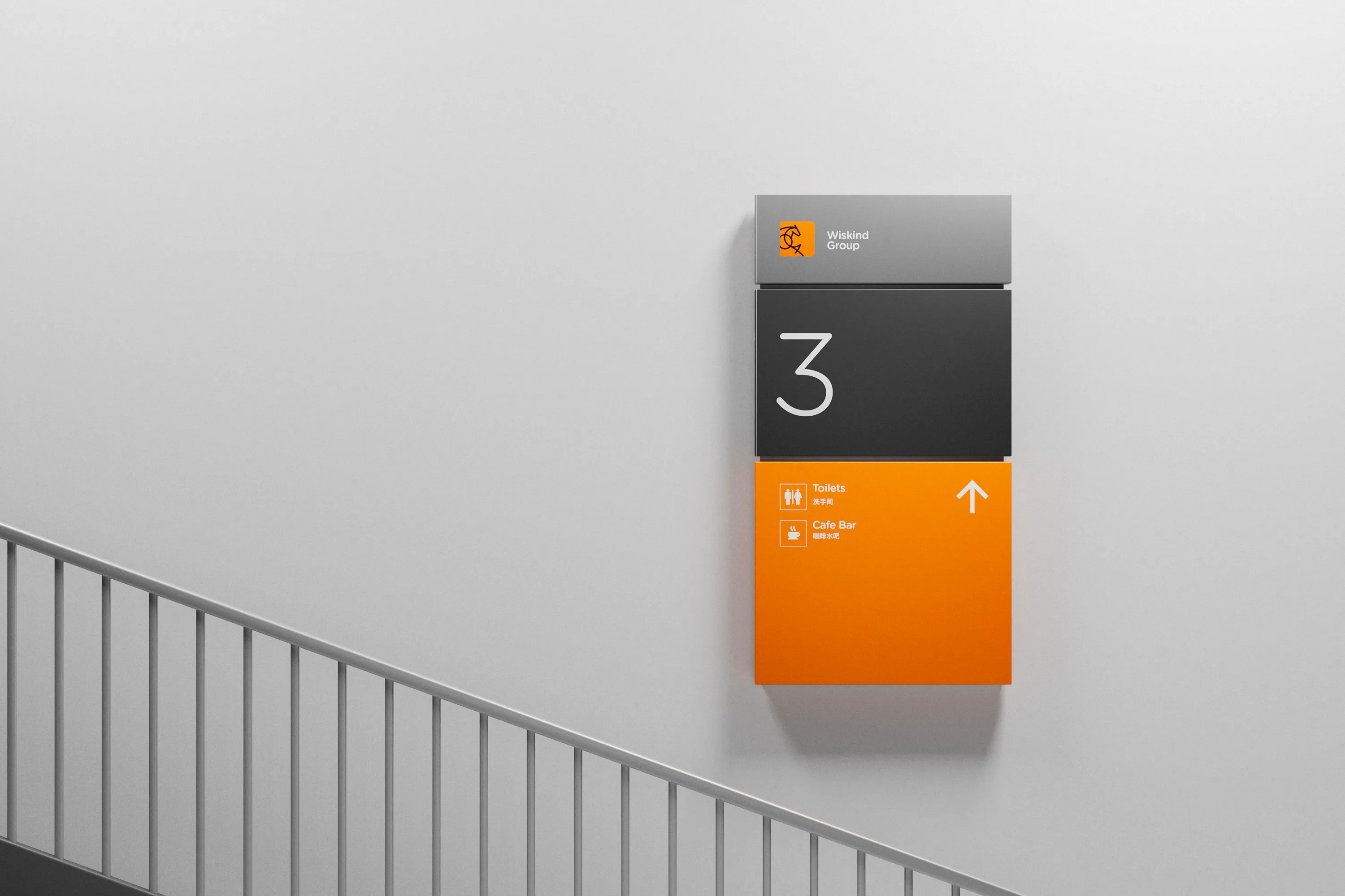
- Space Design
- Website Design

Background
Master Group’s journey began four decades ago with a pony driving a machine—an image that came to represent perseverance and strength. This small yet powerful symbol became a lasting emblem of the company’s dedication to craftsmanship and innovation. Throughout the years, Master has remained committed to industrial progress, technological excellence, and cultural depth, establishing a uniquely Chinese path in the global manufacturing world.
四十年前,万事达集团以一匹驱动机械的小马起步,在时代的浪潮中开启了工业创新的进程。那匹象征动力的小马,不仅是品牌的起点,也是其精神内核的象征。多年来,万事达持续在制造工艺、技术能力与品牌文化上深耕细作,以稳定而坚定的步伐,走出了一条属于中国制造的品牌道路。
The Challenge
As visual expectations evolve and market demands intensify, Master’s previous brand identity no longer reflected its dynamic spirit and forward-thinking values. The challenge was to respect the company’s rich legacy while crafting a renewed identity system—one that could carry the essence of its symbolic pony into the future with clarity, power, and visual relevance across platforms.
在新时代市场环境与视觉审美不断变化的背景下,万事达原有的品牌形象显得过于传统,无法充分传达企业的创新基因和文化精神。我们面临的挑战,是在尊重其深厚积淀的基础上,重新激活品牌的精神象征,建立具有未来导向的品牌视觉语言,助力企业在更高维度上焕发新生。
Solution
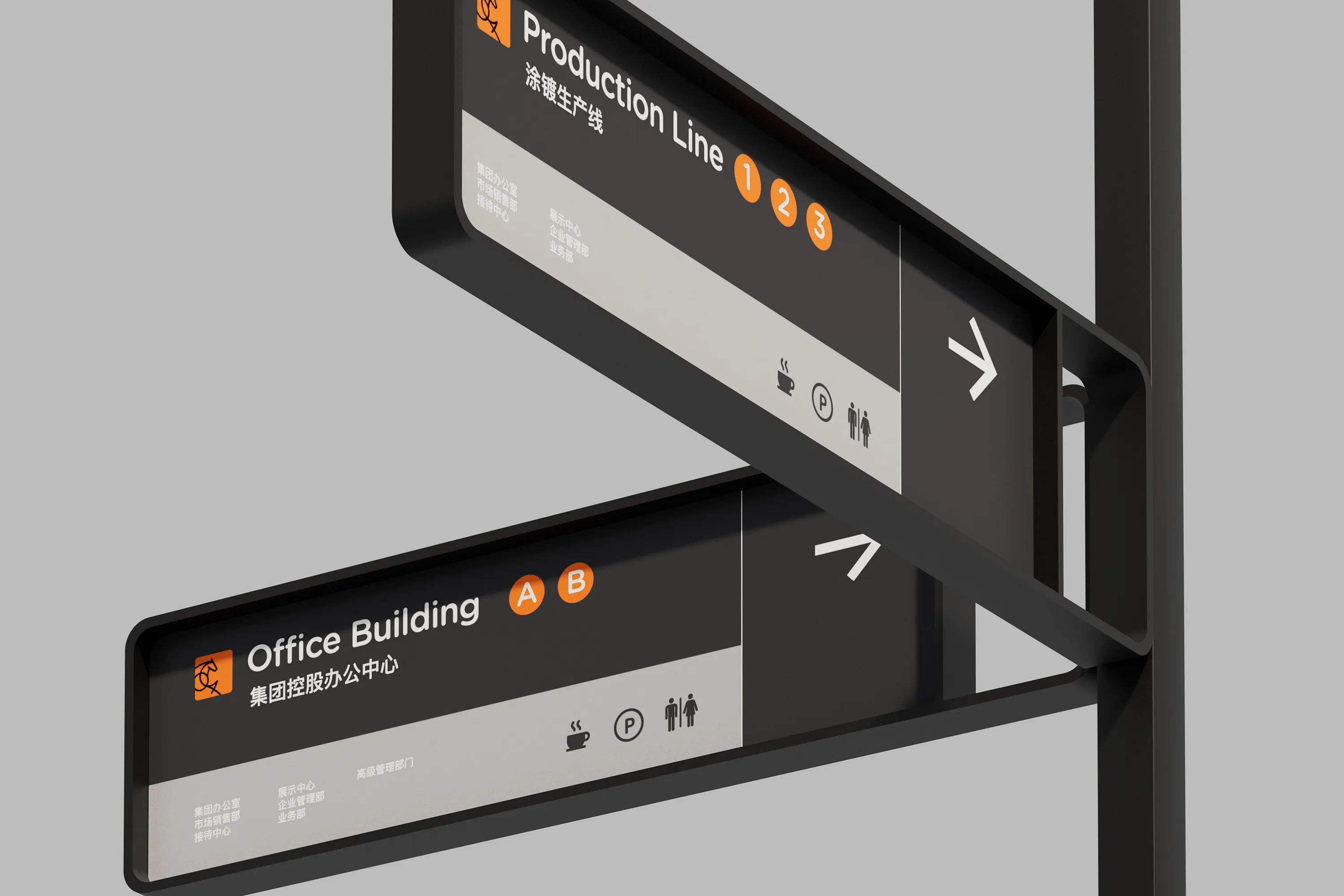
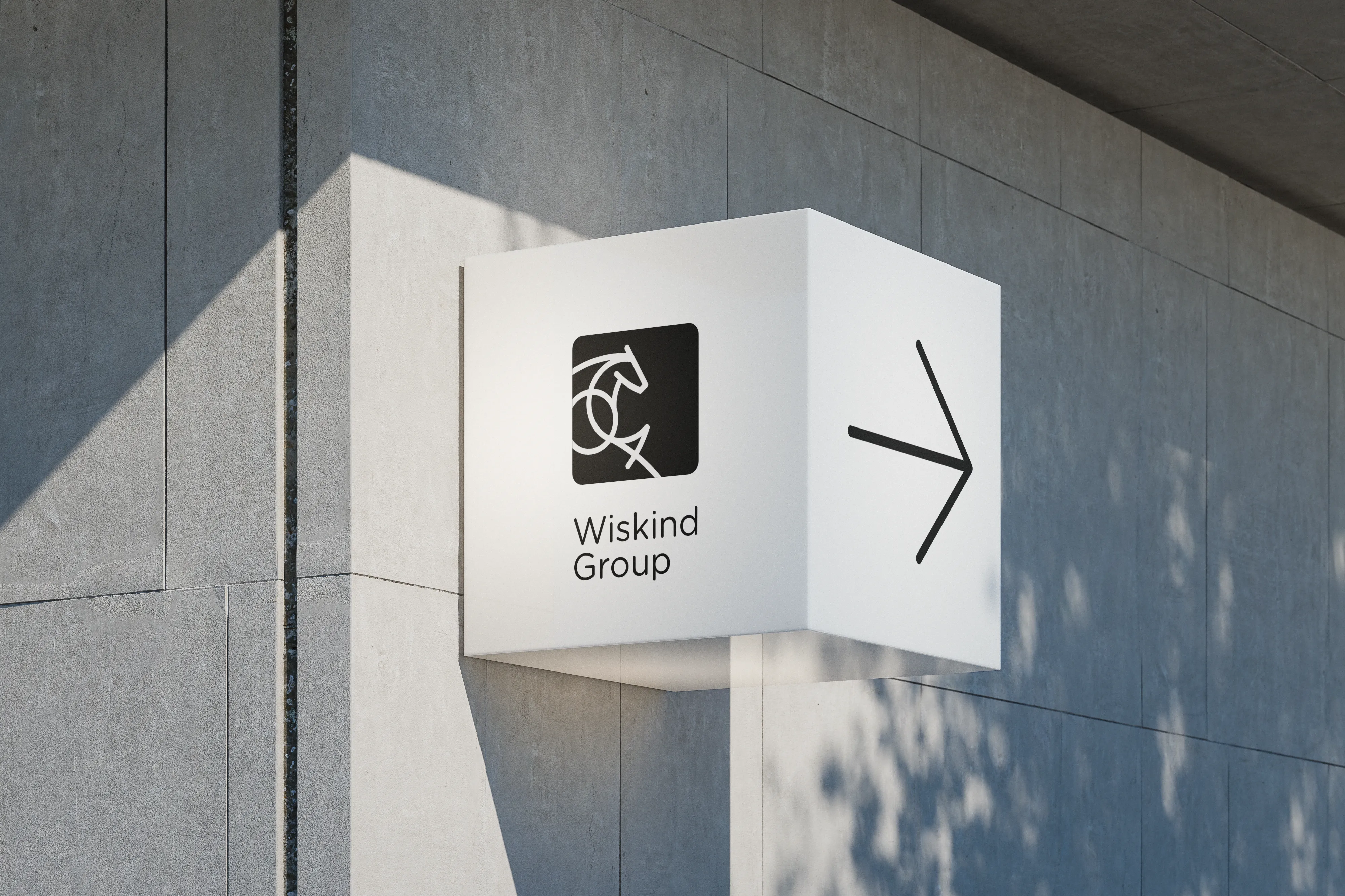
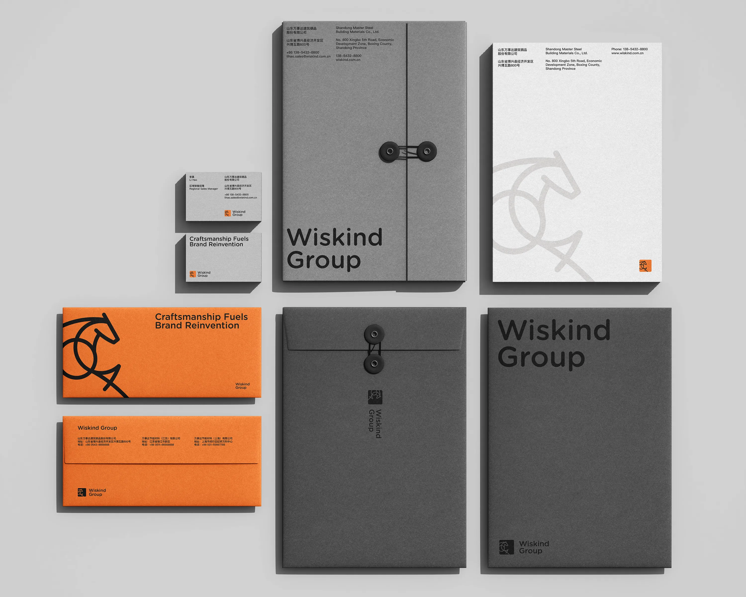
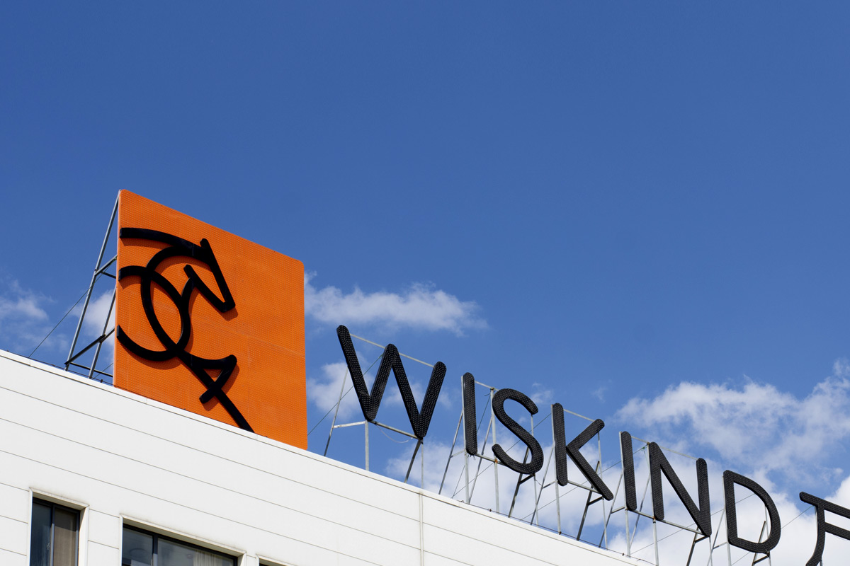
Drawing inspiration from the iconic pony, we designed a new visual identity system rooted in movement, strength, and optimism. The logo and visual elements are streamlined and modern, yet deeply tied to cultural resonance. We developed comprehensive brand guidelines to ensure consistency and scalability across touchpoints. More than just a design project, this was a strategic renewal of a long-standing partnership between Huisheng and Master—focused on transformation, alignment, and long-term brand value.
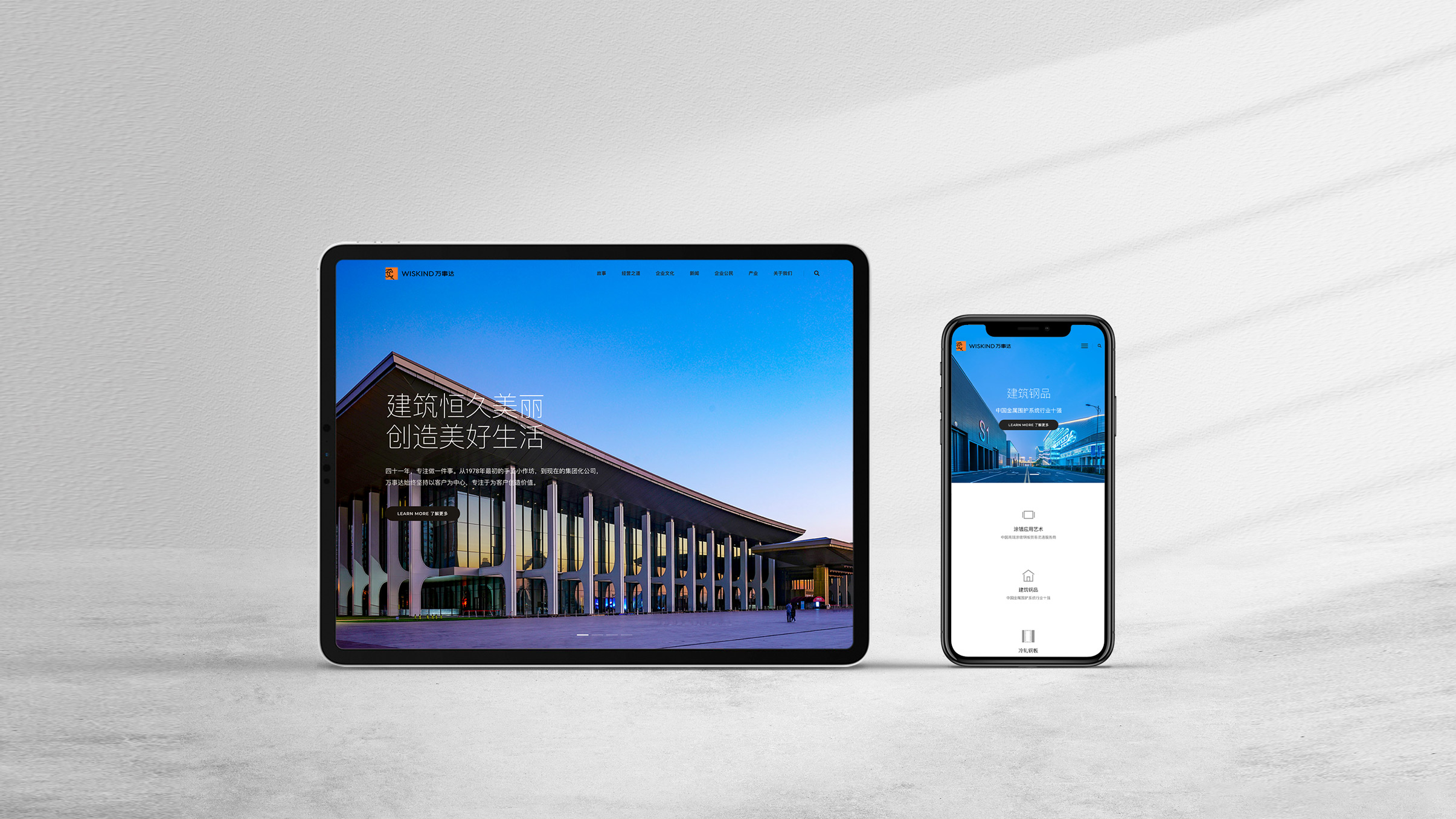
我们以“小马精神”为视觉切入点,重新构建了万事达的品牌识别系统设计聚焦于力量、进取与信念的精神共鸣,结合现代视觉语言,打造简洁而具有文化温度的品牌形象。同时,建立了完整的品牌形象规范系统,并建立了先进的工厂目视化管理系统设计,确保品牌在管理和传播中保持一致性与识别度。此次品牌设计的合作也进一步巩固了RDA与万事达的长期战略伙伴关系,共同书写品牌发展的新篇章。